Financial institutions mobile
A major financial institution needed to digitize and streamline its funding process — making it accessible to both first-time business owners who needed guidance, and experienced professionals who needed speed. I led UX end-to-end: from research and blueprinting through to a scalable design system.
My Role
Senior UX designer
Team
1 lead designer + 2 analysts + 1 PM + devs
Duration
1 year
↑ 35%
Increase in completed applications after launch
↓ 40%
Reduction in application time for business owners
3×
Faster document verification with auto-fill scanning
Early
Stakeholder sign-off after first usability test round
Problem
A funding process that created more work than it solved
Saudi Arabia's financial landscape had no shortage of funding programs — but accessing them required navigating fragmented information, multiple in-person visits, and zero status visibility post-submission. The drop-off wasn't happening because people weren't interested. It was happening because the process defeated them.
No eligibility guidance upfront - complex financial users struggled to determine if they qualified before investing time in an application.
Scattered information - users sourced requirements from multiple branches, PDFs, and phone calls with no single source of truth.
Approval opacity - users had no way to track status after submission, eroding trust in the institution.
Manual document handling - verification was done by staff, creating bottlenecks and inconsistency across branches.
A funding process that created more work than it solved

Ahmad Otayim
Anna is a business analyst who helps her clients to create strategies, to conduct user research and analyze business and user experience goals.
Occupation
Broker
Family
1 wife, 2 children
Age
34
Location
Saudi Arabia, Riyadh
Needs
Ahmad's main goal is to find a home that is within his budget and secure financing that will allow him to purchase it.
He also wants a user-friendly platform that makes it easy to apply for financing and get approved.
He is also concerned about the complexity of the home-buying process and the difficulty of finding a financing option that will meet his needs.
Pain Points
Needs a financing option that is both affordable and accessible
Opportunities to connect with other experienced professionals in the industry
He also needs help understanding the home-buying process and navigating the various financing options available to him.
Wants to see several recommendations from bank.

Sarah Jackson
Anna is a business analyst who helps her clients to create strategies, to conduct user research and analyze business and user experience goals.
Occupation
Software Engineer
Location
London, UK
Family
Single
Age
30
Needs
Learn about new technologies and trends in the industry
Network with industry professionals and potentially find job opportunities
Network with industry professionals and potentially find job opportunities
Gain insights and knowledge to further their career in technology
Pain Points
Access to high-quality, informative sessions with industry experts
Opportunities to connect with other experienced professionals in the industry
Detailed information about the event location, transportation options, and parking
An easy-to-use app that provides all relevant event information, including session details and speaker bios
MY STRATEGIC READ
"The product didn't have a design problem — it had a trust problem. Users couldn't see what they were entering, couldn't compare competitions easily, and couldn't tell if the platform was legitimate. We needed credibility before we needed features."
Service blueprint
Mapping the invisible work
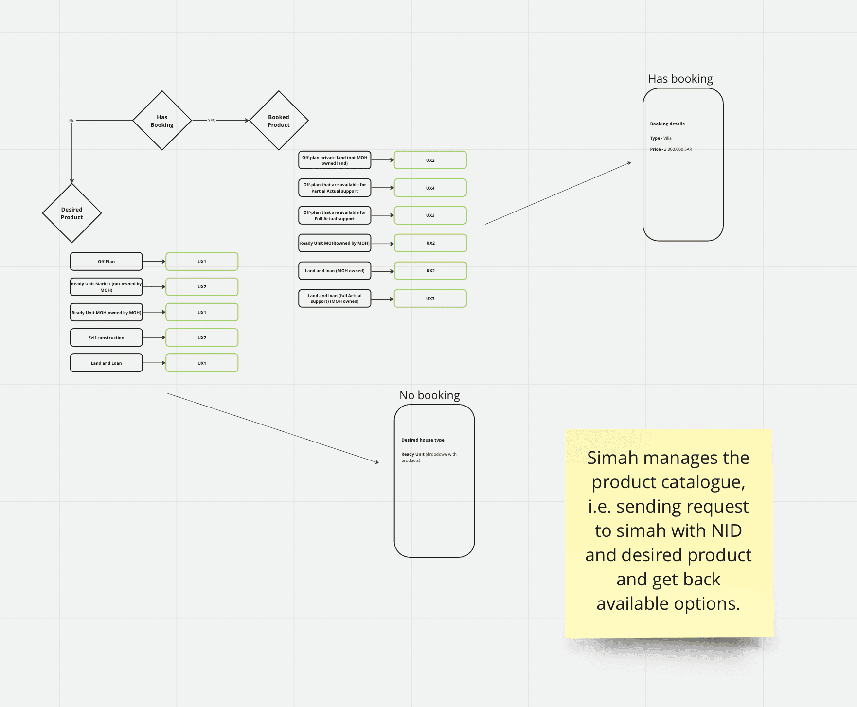
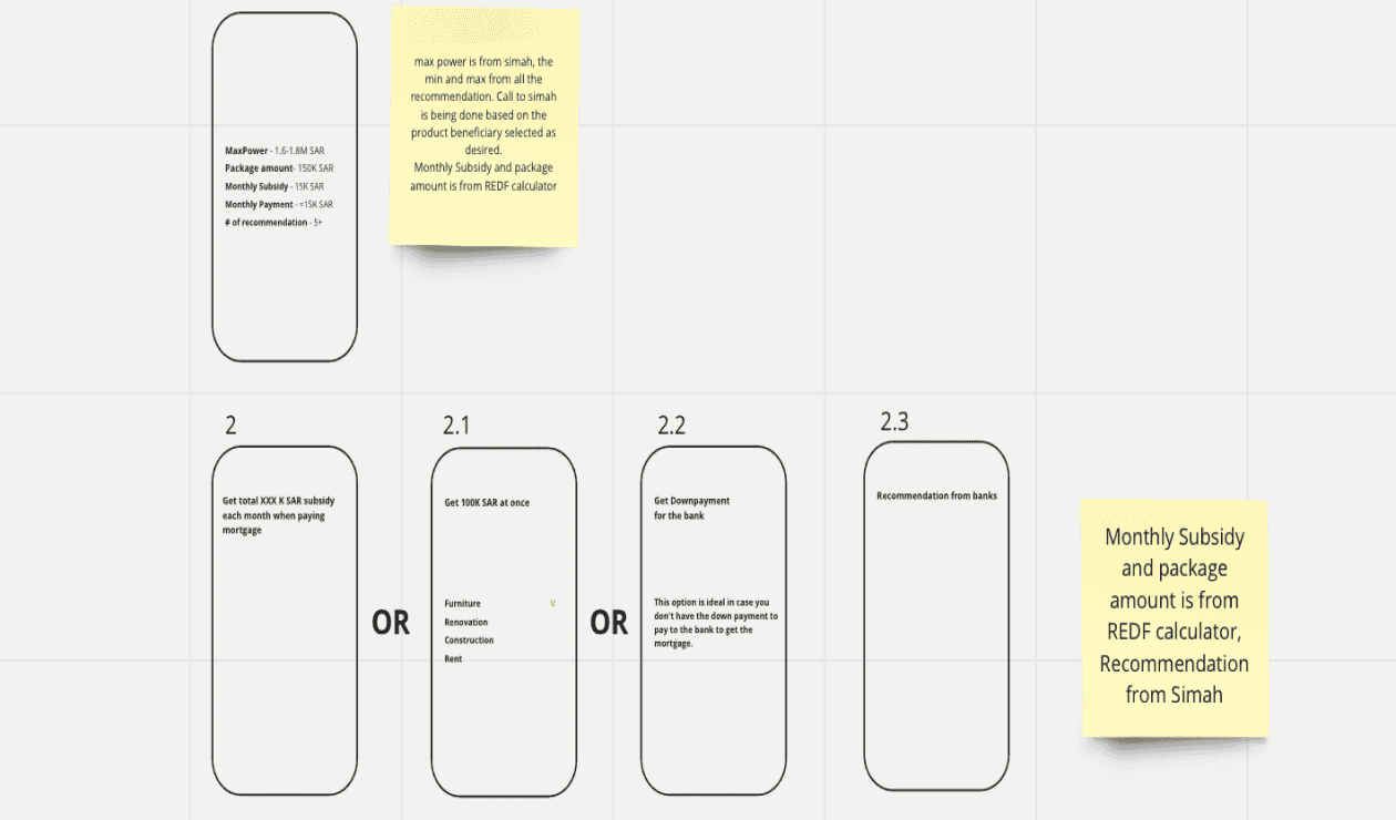
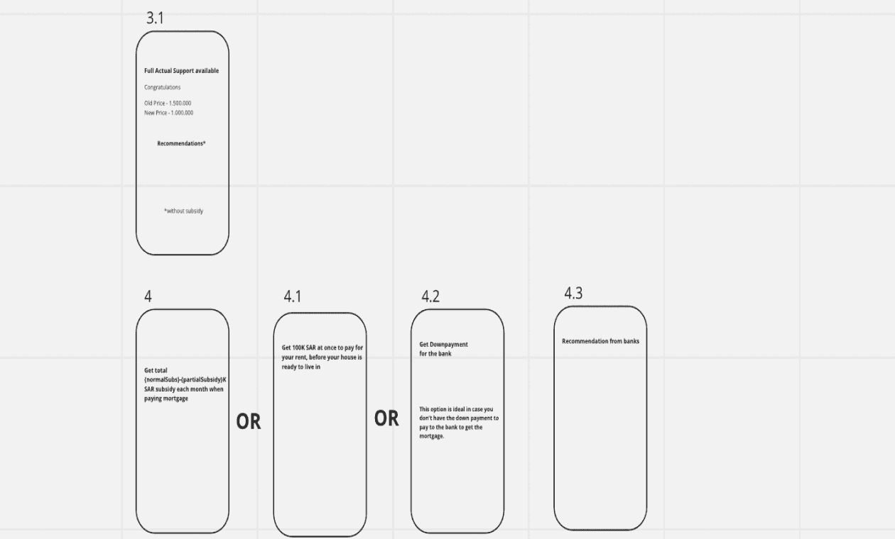
Before wireframing anything, I built a full service blueprint that mapped the user journey against the backend approval workflow — including the manual steps that happened off-screen.
This document became the shared contract between UX, PMs, and developers. Three critical gaps it revealed:
Four root problems surfaced in early stakeholder interviews before any user research began:
No handoff visibility after submission
Applications entered a black box — nobody internally tracked status in a queryable way, which is why users had to call. We designed the approval tracker as a product priority, not a nice-to-have.
Eligibility checks happened too late
Staff manually verified eligibility at review — often days after submission. Moving an automated eligibility check to the front of the flow cut wasted effort for both users and staff.
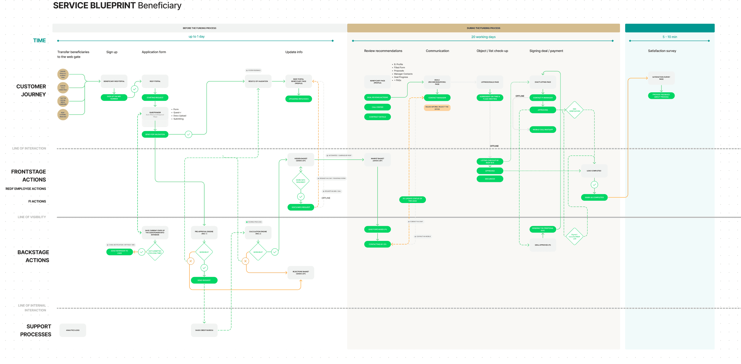
Beneficiary
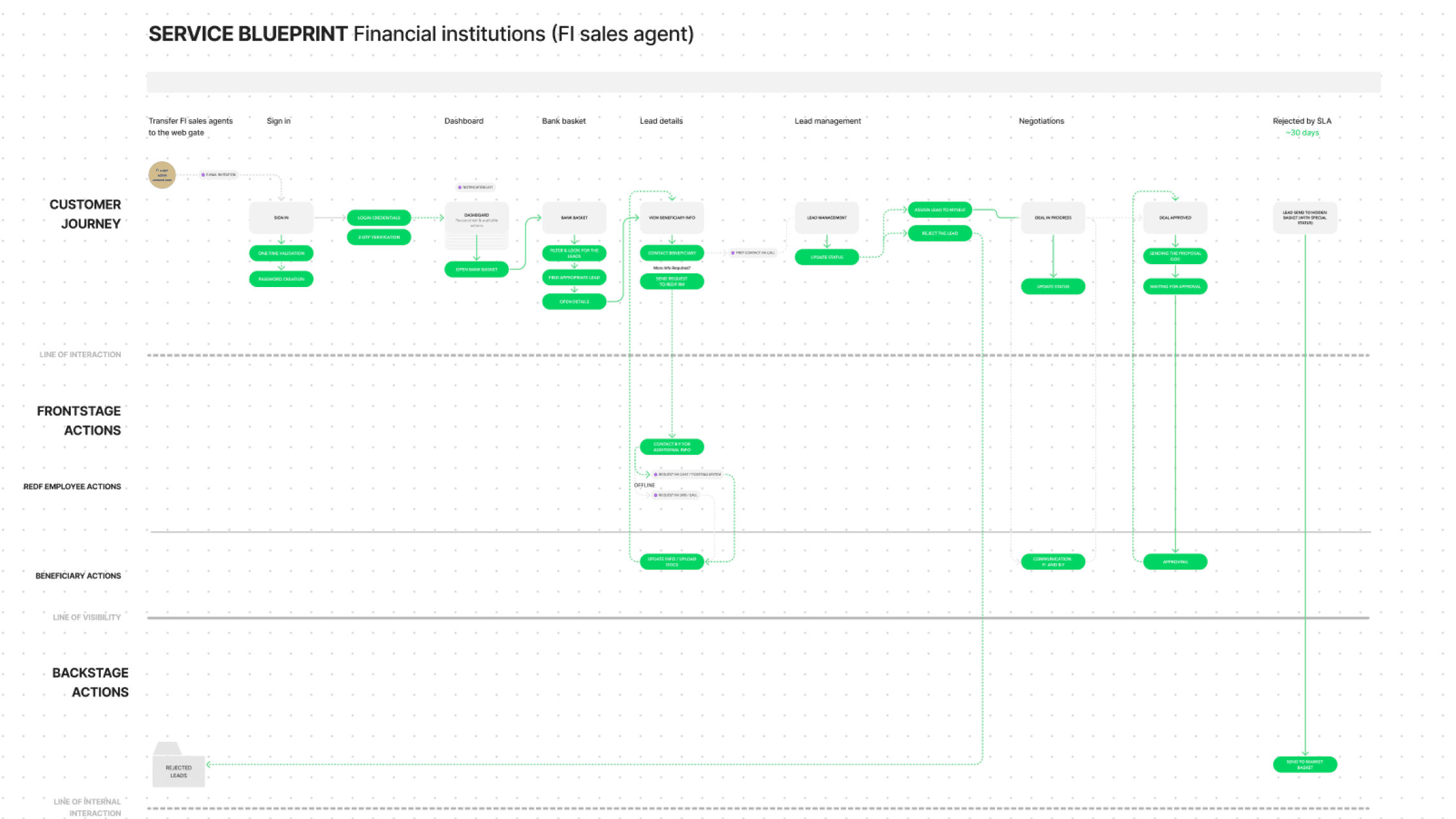
FI agent
Key design decisions
Not just what — why these choices, not the obvious ones
Before wireframing anything, I built a full service blueprint that mapped the user journey against the backend approval workflow — including the manual steps that happened off-screen.
This document became the shared contract between UX, PMs, and developers. Three critical gaps it revealed:
Four root problems surfaced in early stakeholder interviews before any user research began:
Eligibility check as the entry point
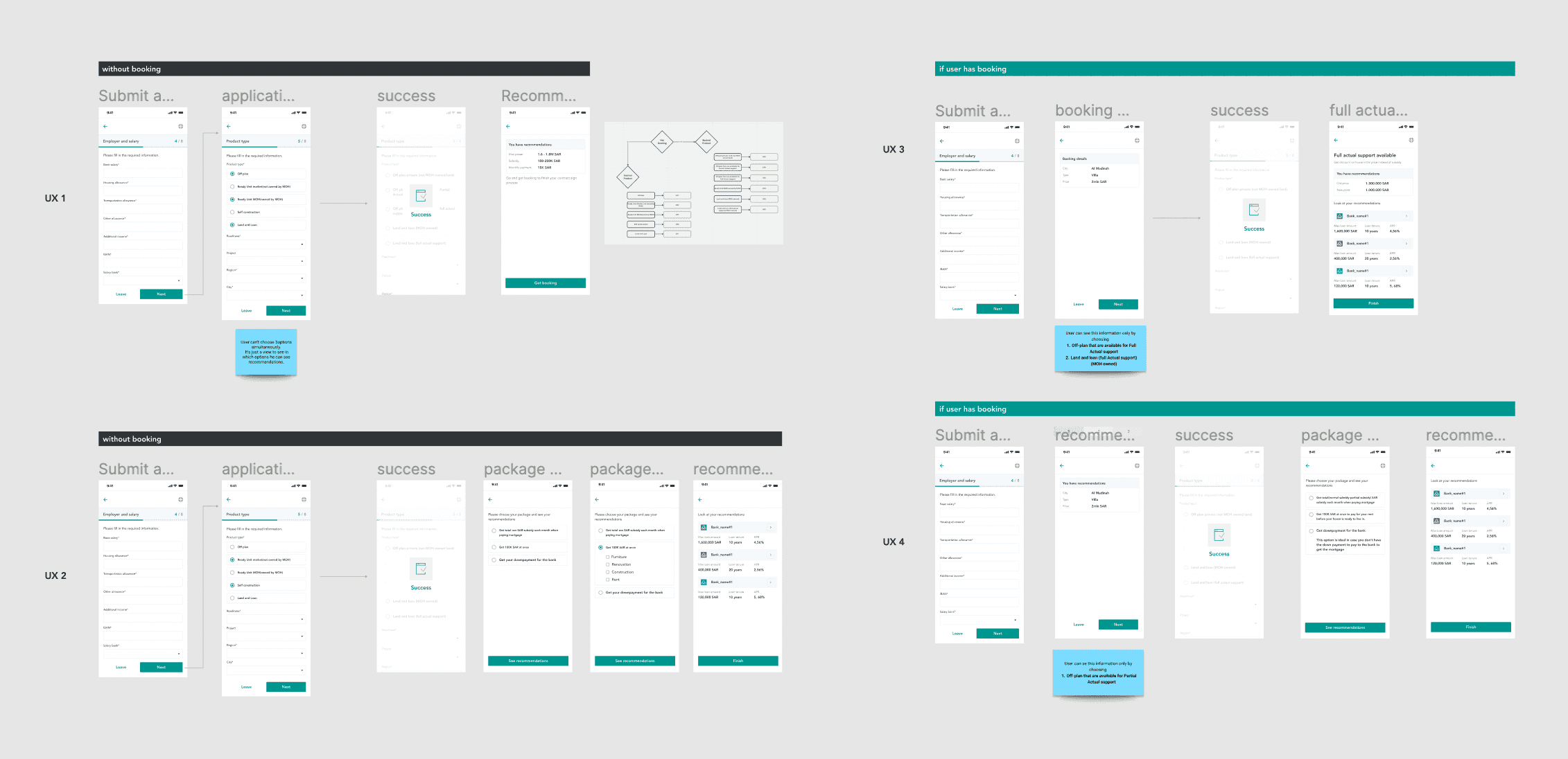
On the dashboard, users choose between a step-by-step guided flow (for first-timers) and a direct application form (for professionals). Both reach the same backend submission.
Why: The obvious choice was to start with the application form and validate at the end. But data showed ~30% of in-person applicants were ineligible. An upfront check removes their wasted effort and reduces staff review load — a business win, not just a UX win. I framed this to stakeholders as an abandonment-rate reduction strategy, which got it prioritized.
Two entry modes: guided vs. direct
The approval tracker shows 5 milestones (submitted → under review → additional documents → approved/rejected) rather than an internal step count.
Why: I considered using behavioral signals to auto-detect user type — but this added implementation complexity and could misroute users at critical moments. Explicit choice takes one extra tap and gives users full control. In testing, 100% of professional users chose "direct entry" without hesitation.
Mobile-first throughout, not mobile-adapted
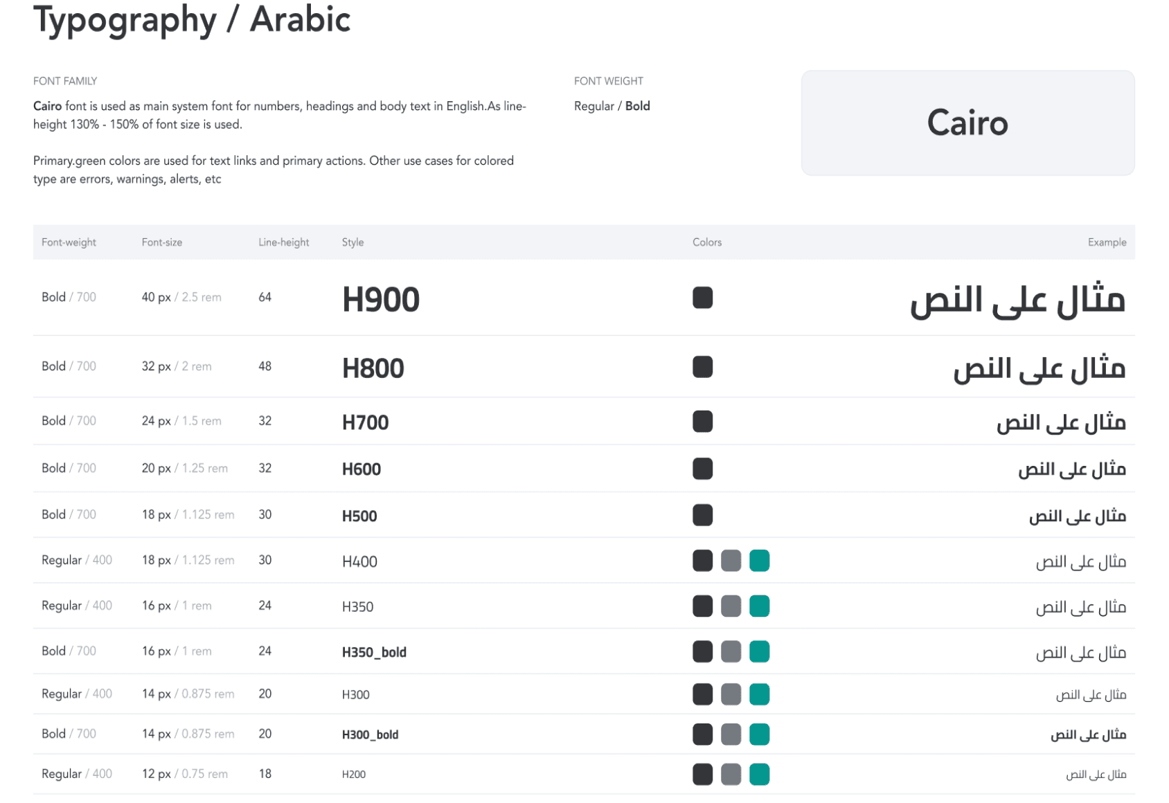
All wireframes began at 375px. Desktop layouts were derived from mobile, not the reverse.
Why: Analytics from a comparable government service showed 78% mobile usage. Designing mobile-first forced prioritization decisions on every screen — if it couldn't fit on mobile, it didn't belong in the flow at all.
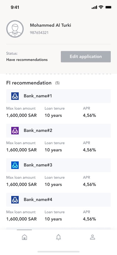
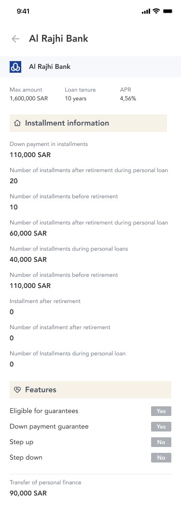
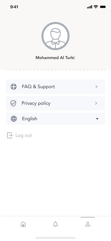
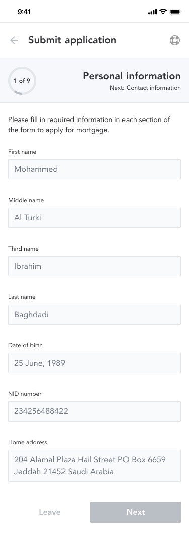
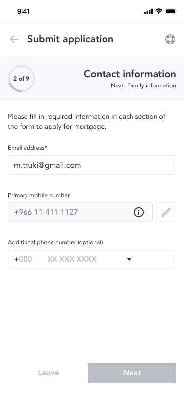
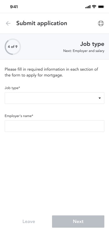
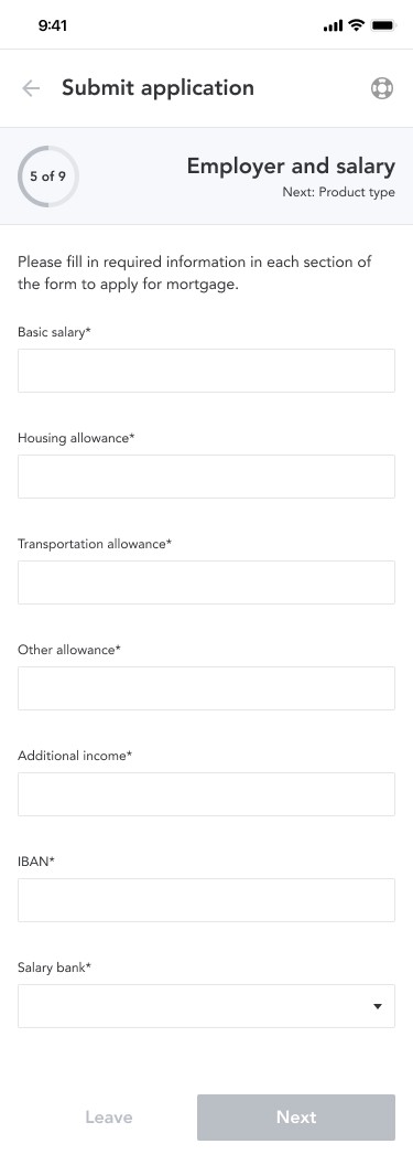
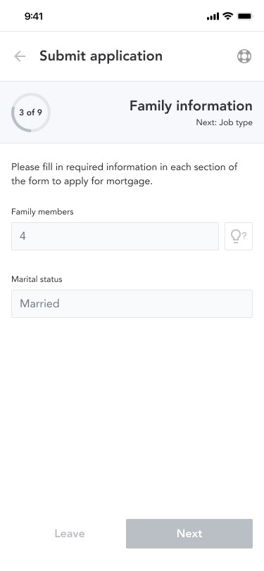

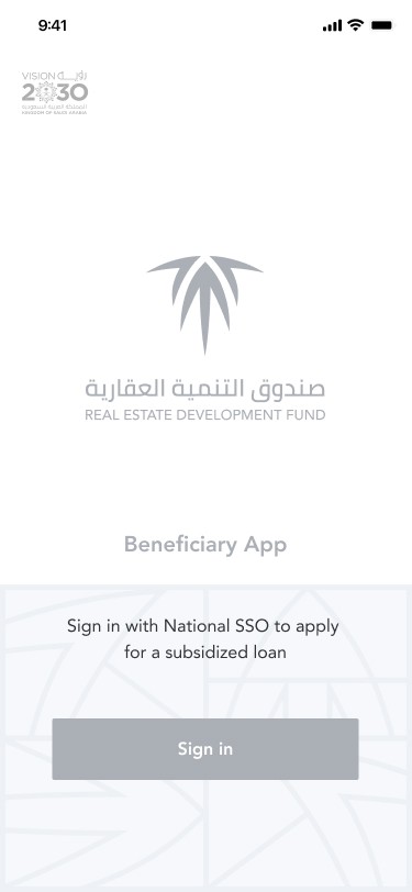
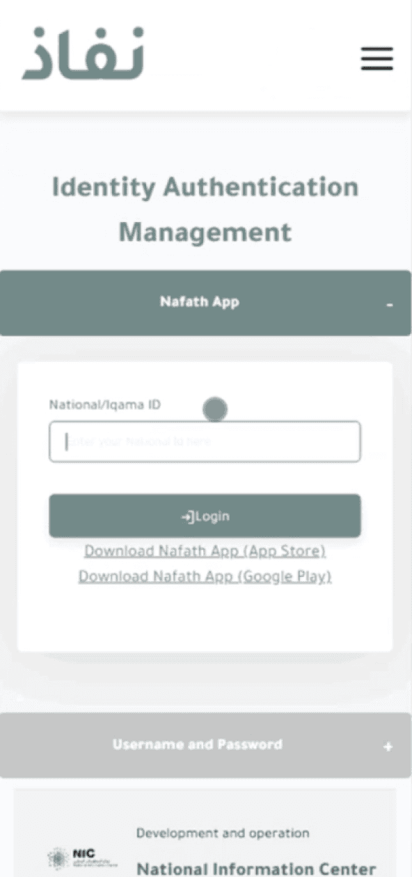
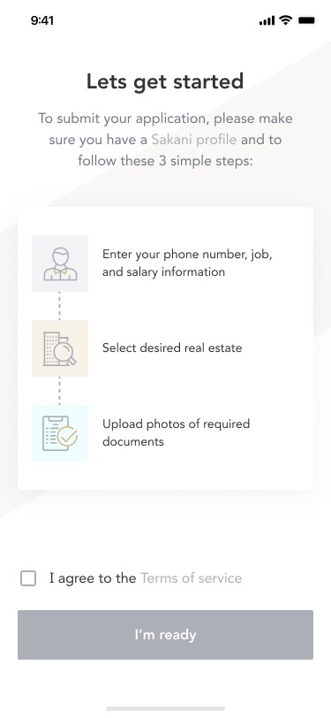
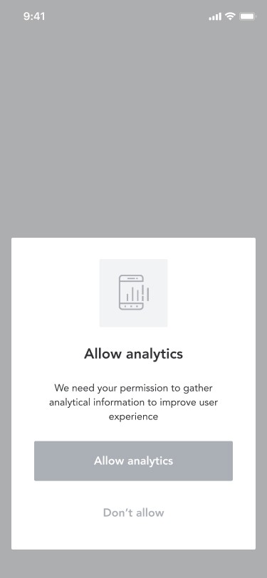


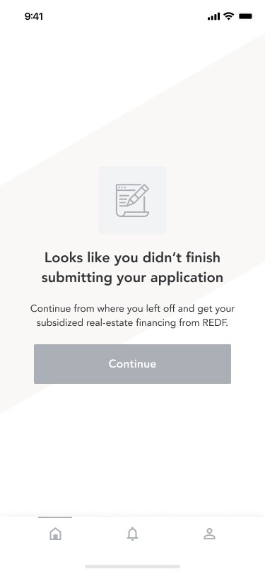
+ 50 more screens

Outcome & impact
Shipped, tested, and handed off with confidence
The product was handed off to development after two rounds of usability testing. Early-access testing with a pilot group of 80 applicants confirmed the core hypotheses:
Fewer incomplete submissions
Guided flow and upfront eligibility check reduced mid-form abandonment by ~40% versus the previous paper process.
Fewer incomplete submissions
Guided flow and upfront eligibility check reduced mid-form abandonment by ~40% versus the previous paper process.
Support call reduction
62% of pilot users checked status via the tracker without contacting support — a major ops cost reduction signal.
Stakeholder alignment
The service blueprint became the product team's shared source of truth throughout development — referenced in sprint planning.
What I'd do differently
Reflections
Two things I'd change with more time or earlier buy-in:
Quantitative baseline earlier. We didn't have instrumented analytics on the old process, so improvement metrics relied on user recall and staff estimates. A brief intercept survey or call-log analysis upfront would have given us a harder baseline to compare against.
Test with professional users sooner. The Sara persona was recruited later in usability testing because we assumed first-time applicants were the primary risk. In hindsight, the professional flow had more edge cases and deserved its own testing round.