LP platform discovery & UI
Turned an undefined product brief into a validated design system and investor-ready platform — from zero user research to high-fidelity UI in two phases.
My Role
Senior UX Designer
Team
1 PM, Product Designer(full time), Team lead (2 hours)
Duration
1 year
~2×
Qualified leads after Phase 1 delivery
100+
Components in the atomic design system
Closed
US investor round — materials we built used in the pitch
Greenlit
Product approved for continued development
The strategic problem
The company enables GPs to unlock private equity data and route it to insight - real-time, granular, and investor-facing. But the product had a foundational gap: user needs were undefined, journeys were poorly structured, and no usability validation existed.
The surface problem was a confusing interface.
The real problem was that nobody had spoken to users yet - so any redesign would be redesigning assumptions, not reality. I made that case to the client and structured the engagement around research first, design second.
Why I pushed for discovery before any design work
The client's instinct was to start with screens. I reframed it as risk: without a validated user model, we'd be building on guesswork. A structured discovery phase would take longer upfront but prevent the far more expensive rework of shipping a product that users couldn't navigate. They agreed. That framing shaped the entire engagement.
Why build the design system before any screens
The faster path felt like designing screens directly. But screen-level work done without a shared component library creates a hidden cost: every component gets rebuilt from scratch, inconsistently. I proposed the system first — it added time upfront and saved a significant rework cycle later. The 100+ components we shipped became the foundation Phase 2 was built on without any reinvention.
Phase 1 - From chaos to clarity: discovery & design foundation
UX review & pain point mapping
Identified key accessibility and journey failures across the existing platform. Used these findings to define the scope of interview and testing work — not to jump to solutions.
User scripts for structured research
12 user interviews across two groups (MVP users + post-MVP). Informed the order bump structure, exclusive offers logic, and the checkout cross-sell approach.
~2× increase
in qualified leads attracted - a cleaner product narrative made the platform credible to a broader audience
100+ component library
shipped and adopted internally - the client's team extended it without needing further design support
Stakeholder alignment
established - structured before/after communication built confidence and secured Phase 2 scope
Business analyst function
introduced to the team - a structural gap I identified and helped the client resolve
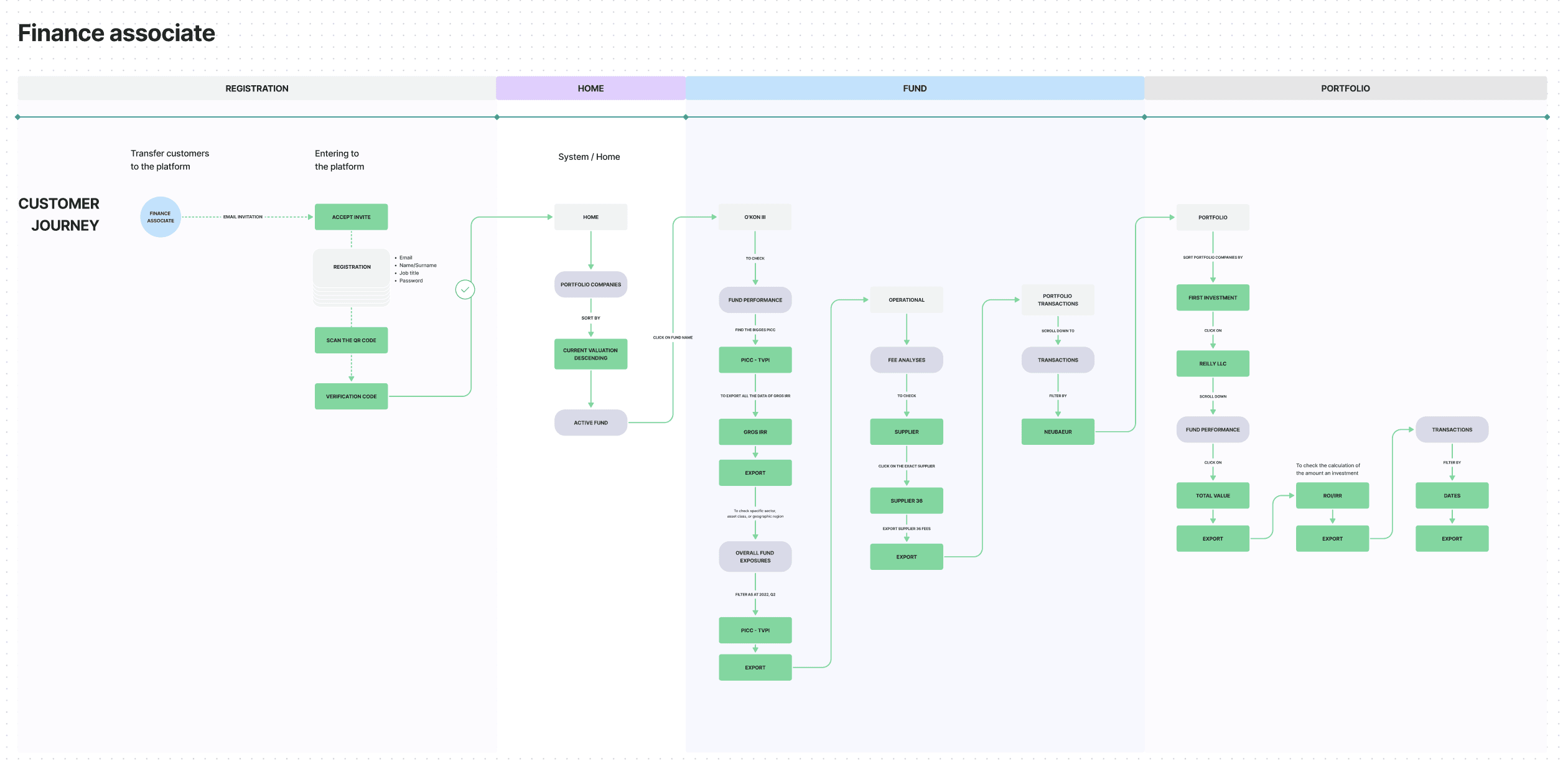
User personas & journeys
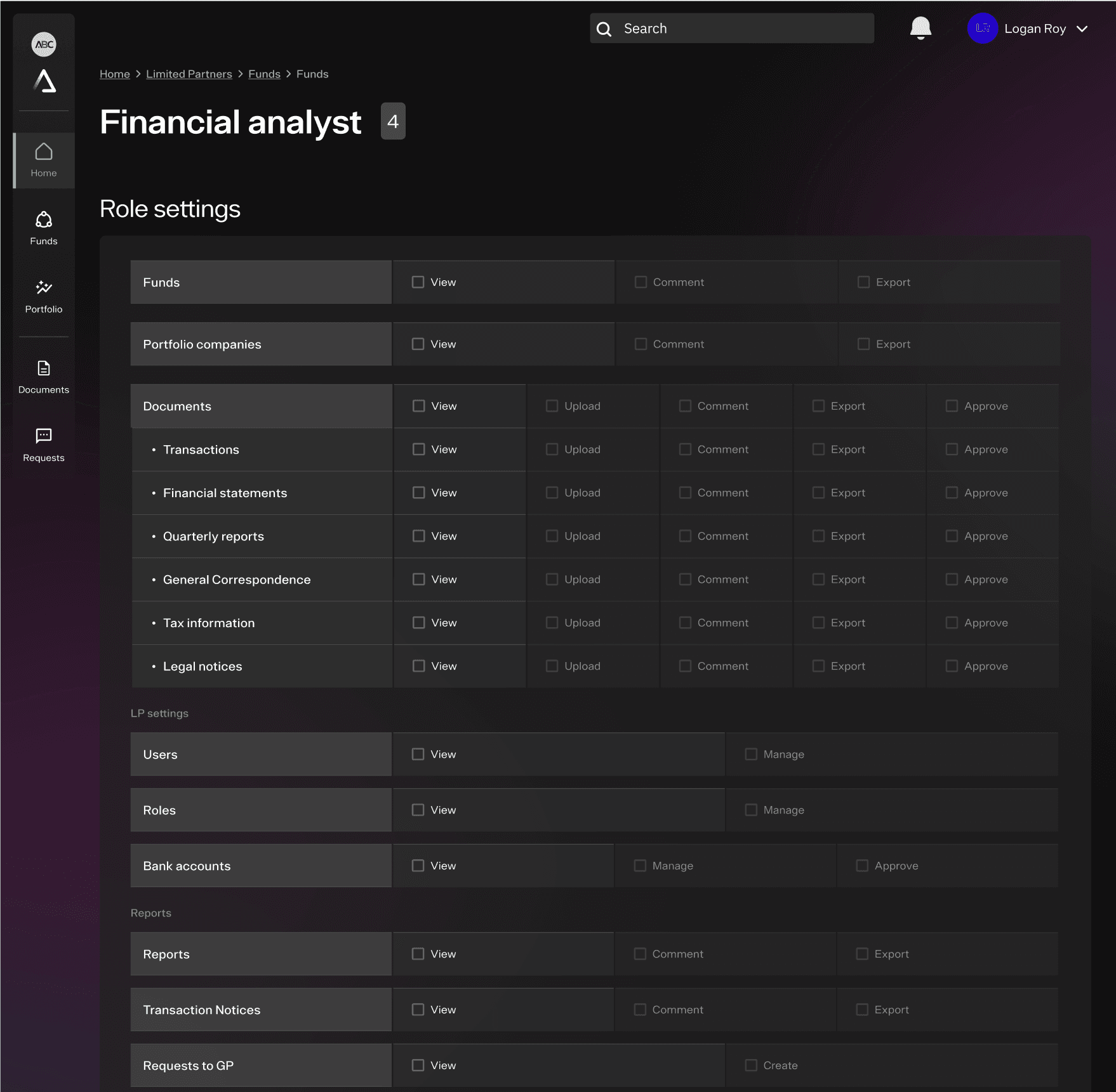
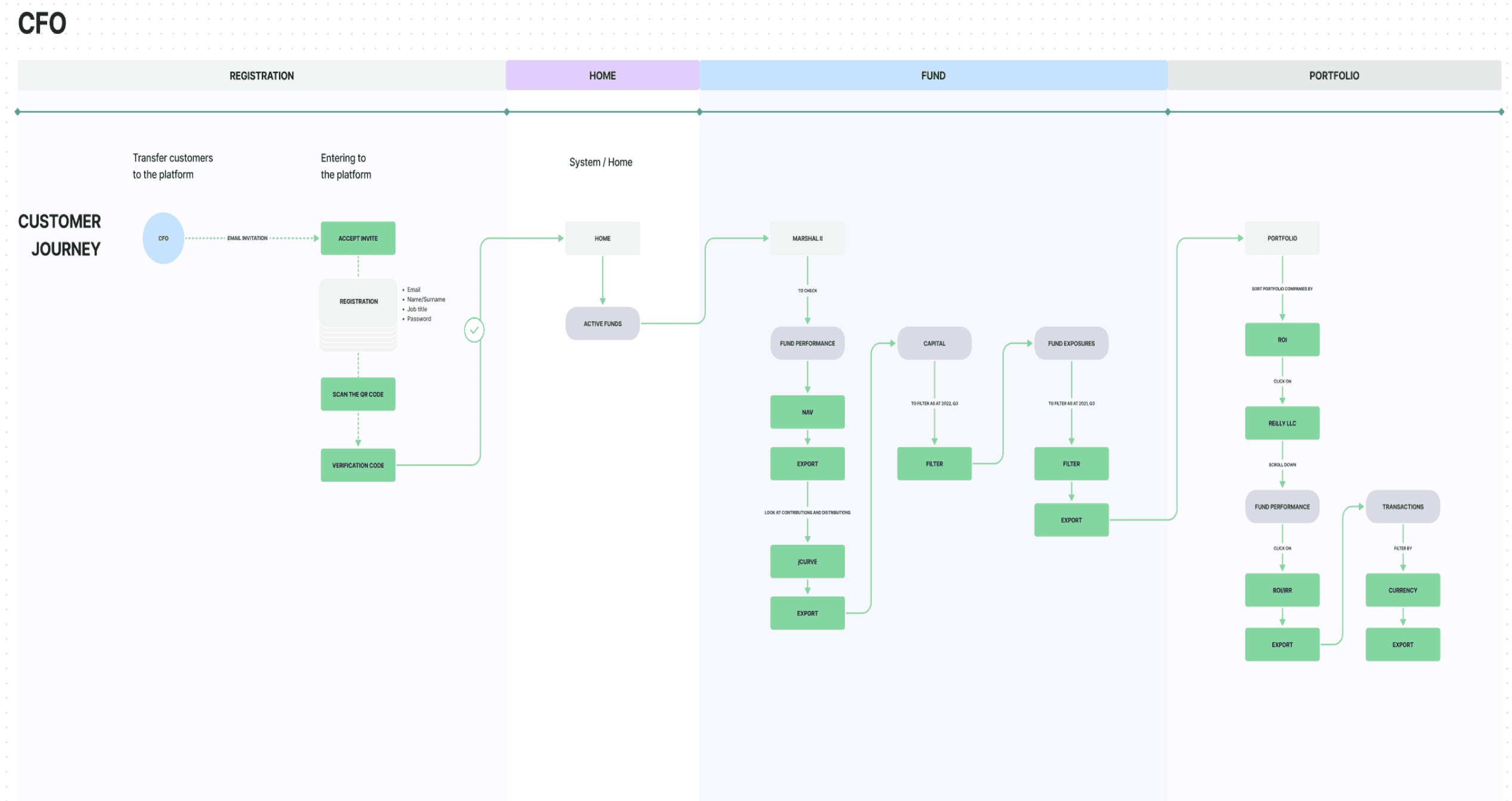
Extensive wireframing based on research from workshops. Personas were grounded in actual LP types and private equity fund structures — not generic archetypes. Each journey mapped to a business scenario, not just a task.
Prototype for user interviews
Built a testable prototype early in Phase 2 to validate assumptions before committing to high-fidelity. This let us run structured user interviews and adjust core navigation decisions based on real behaviour, not intuition.
1st impact
The first phase established clear goals and built strong collaboration with the client, earning recognition letter. As a result, the business attracted more qualified leads and improved relationships with key stakeholders, paving the way for future expansion.
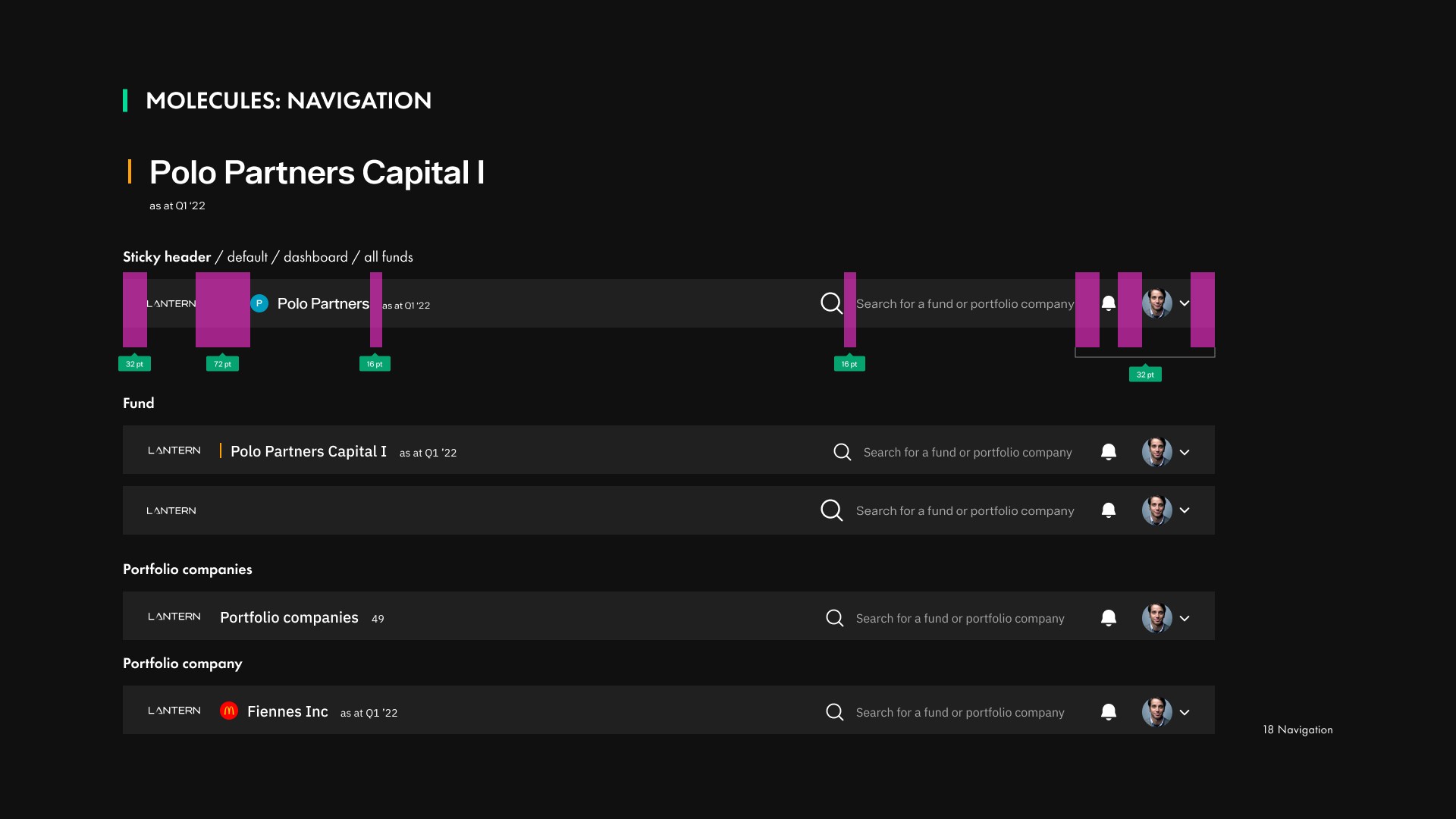
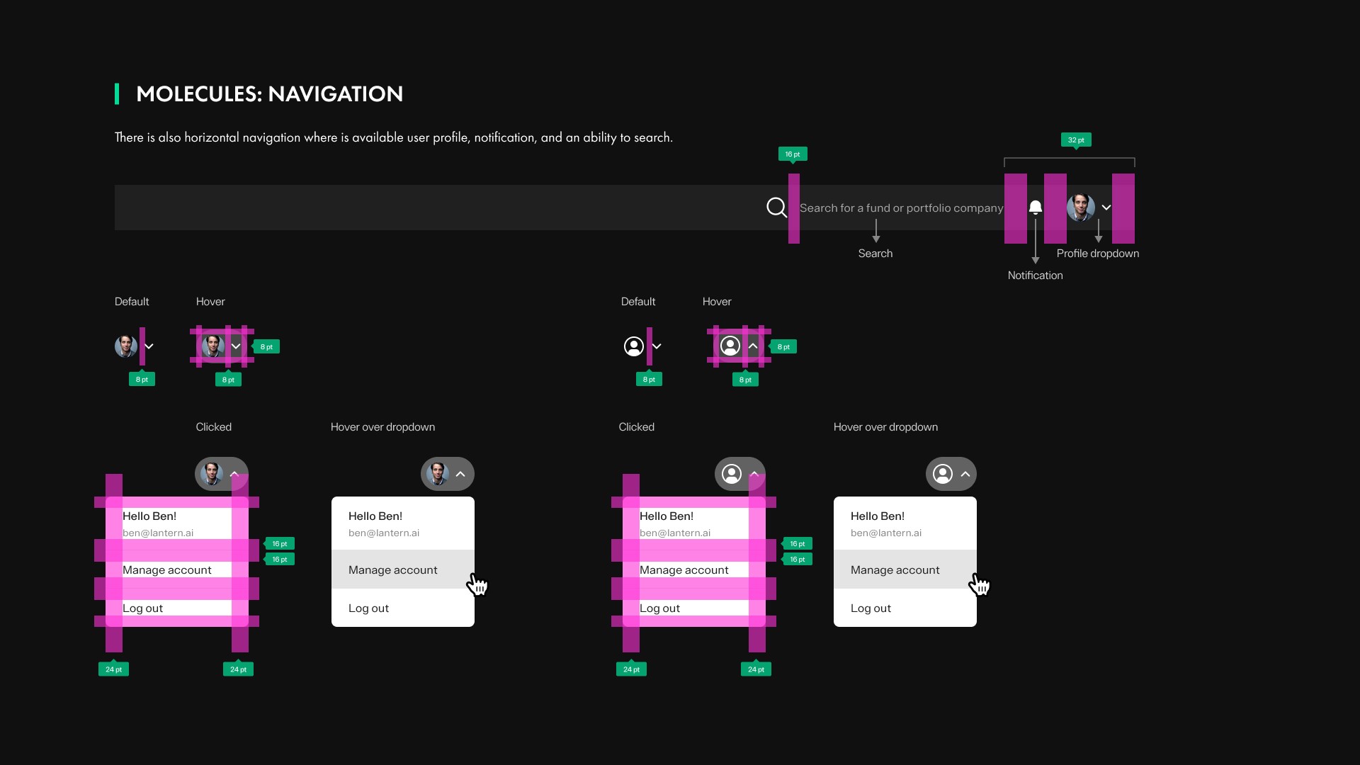
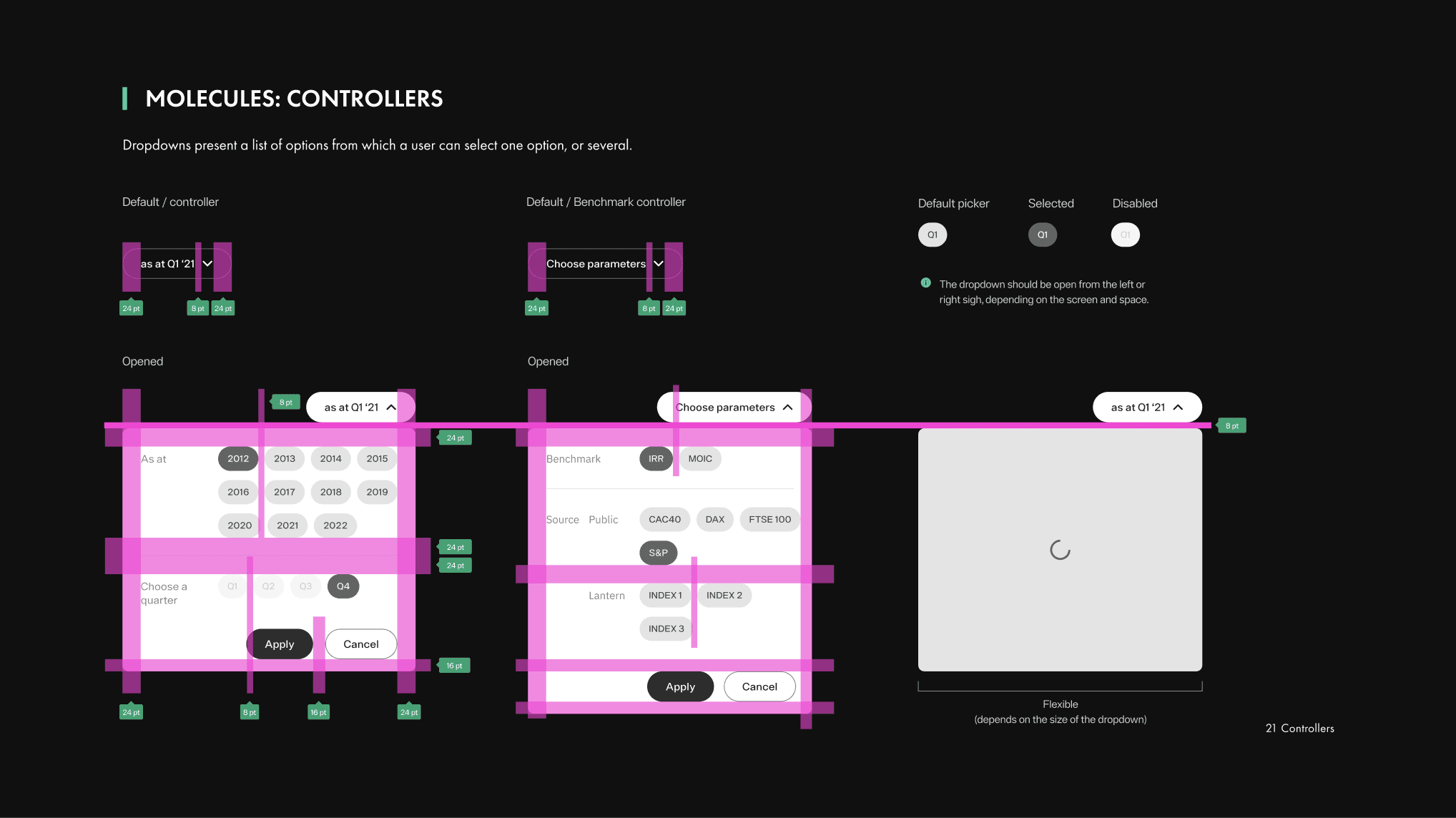
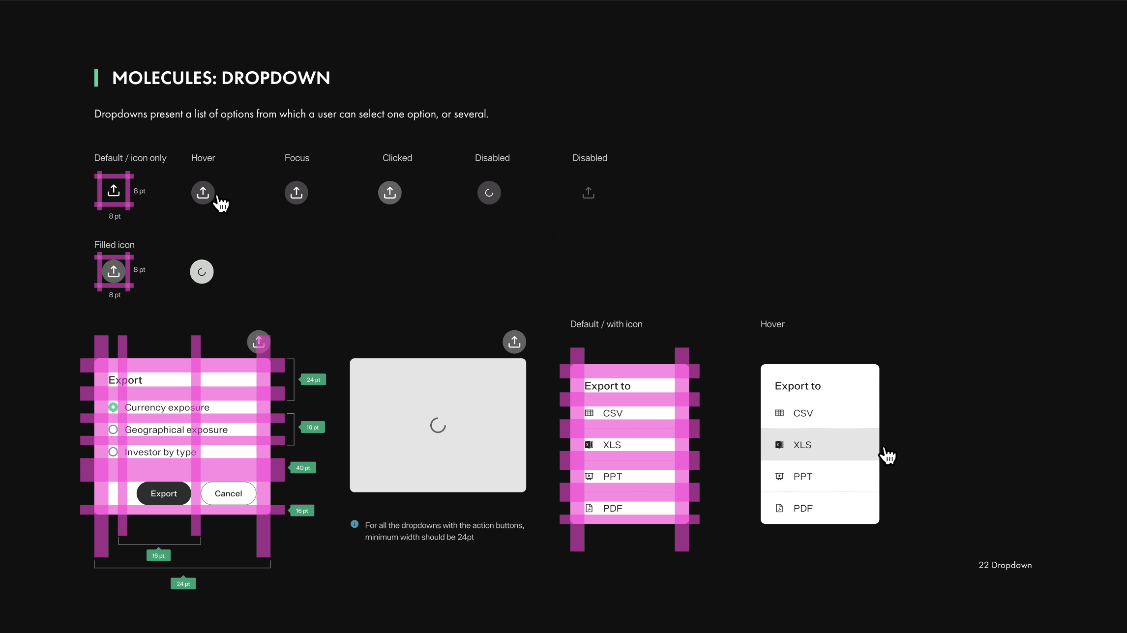
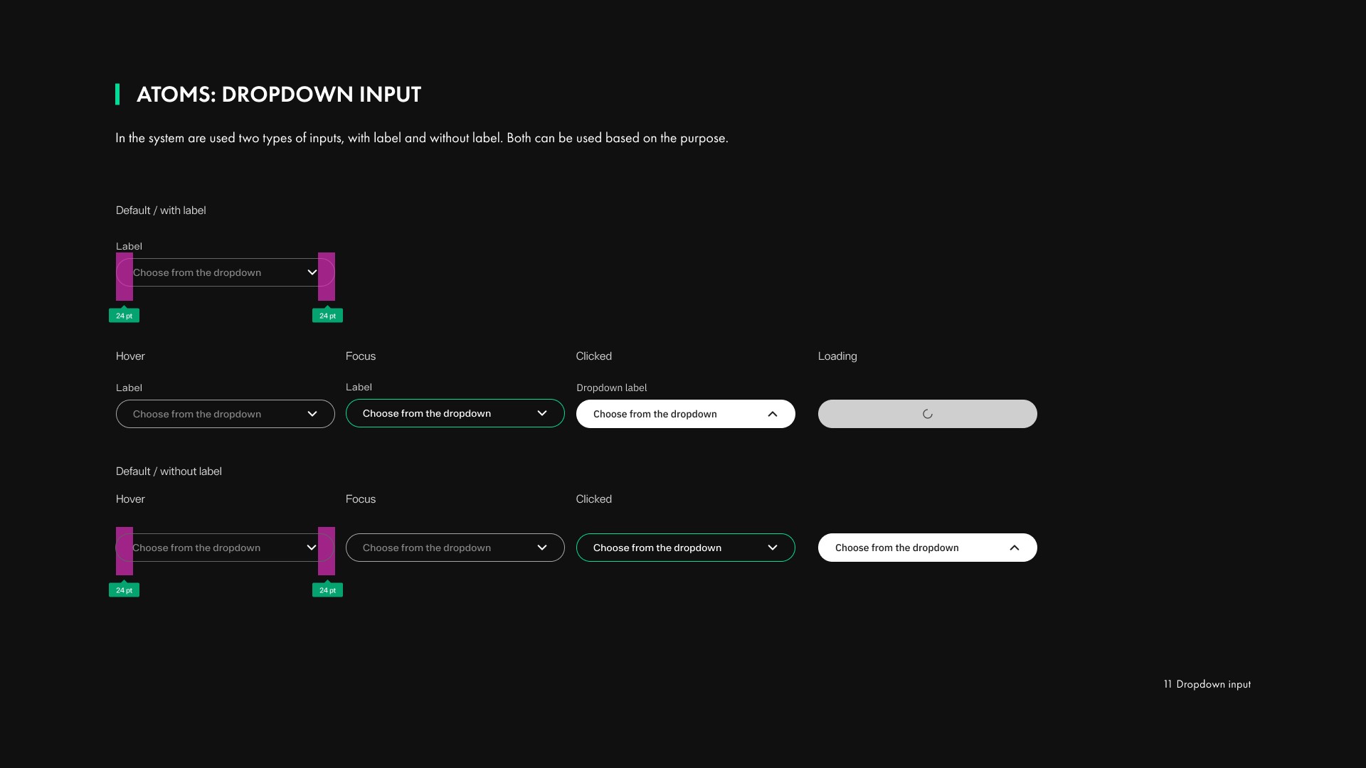
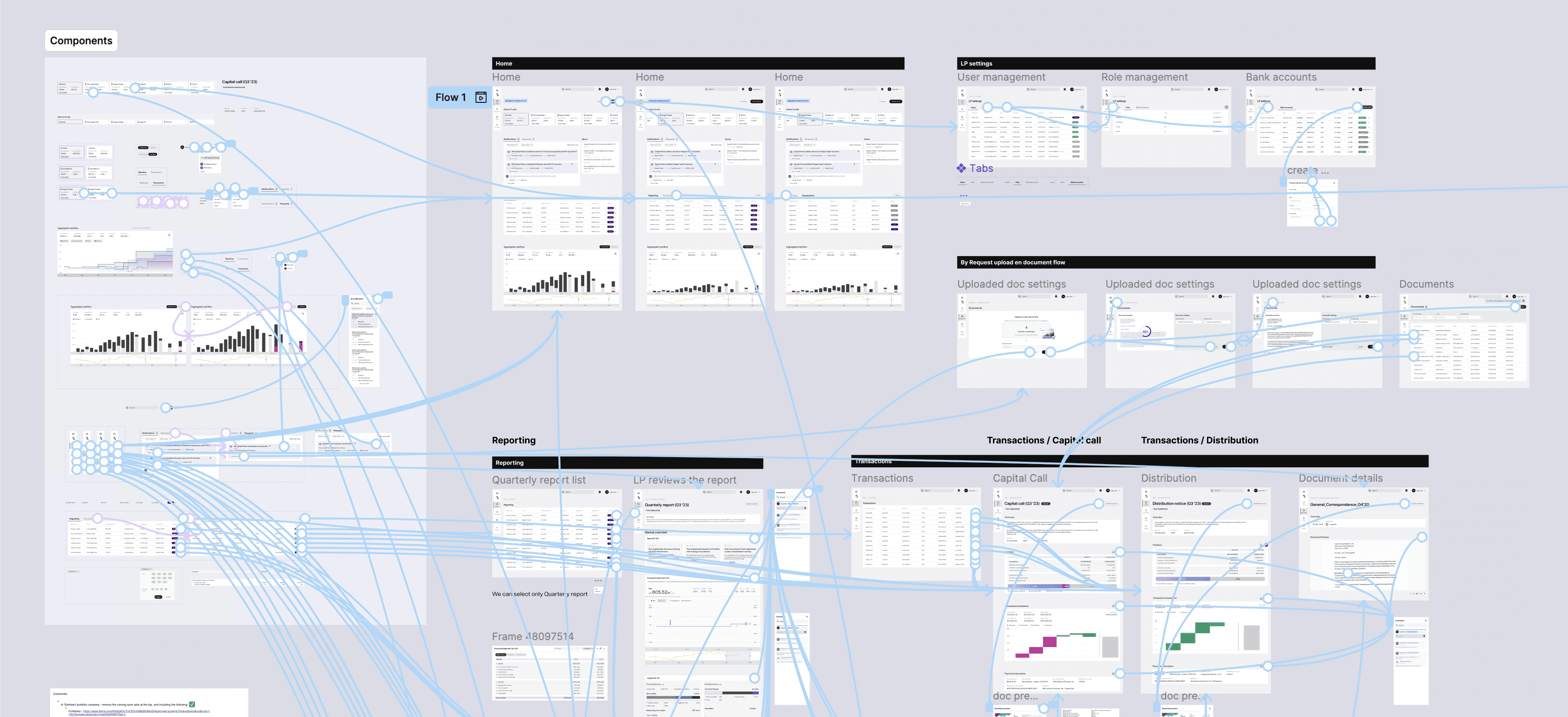
Atomic design system - 100+ components
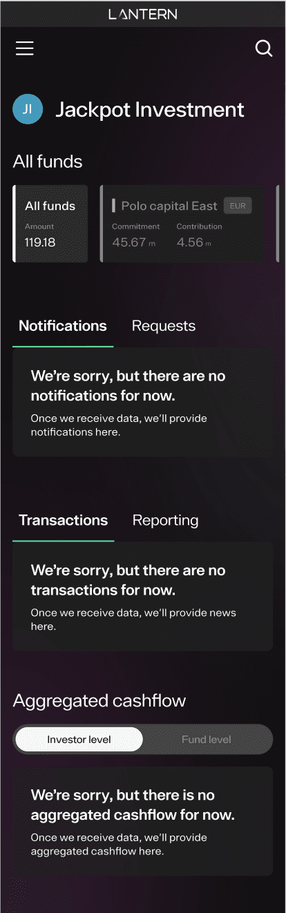
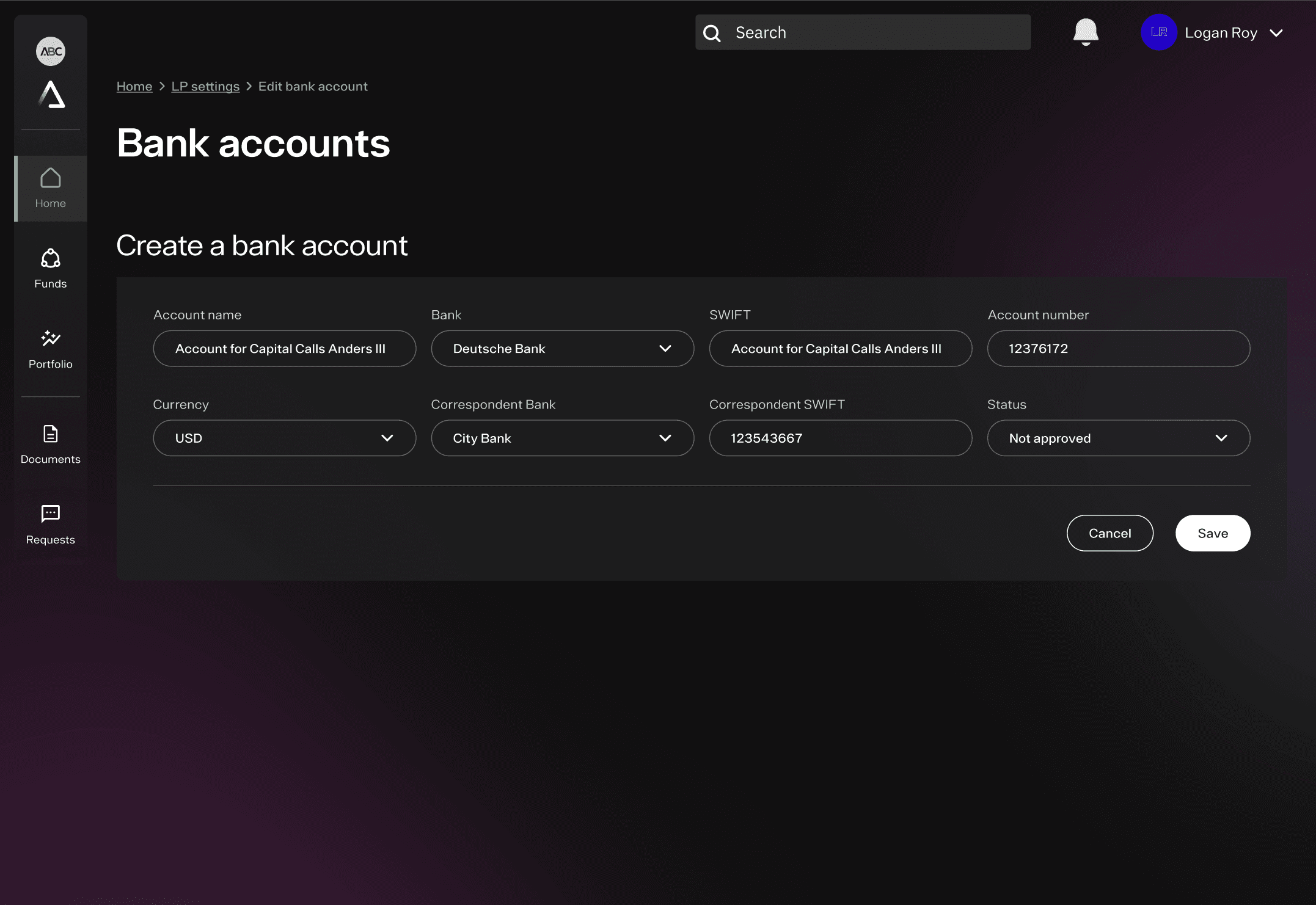
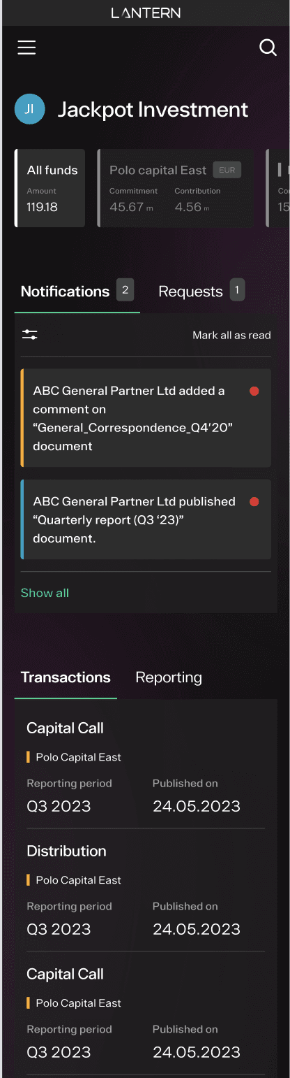
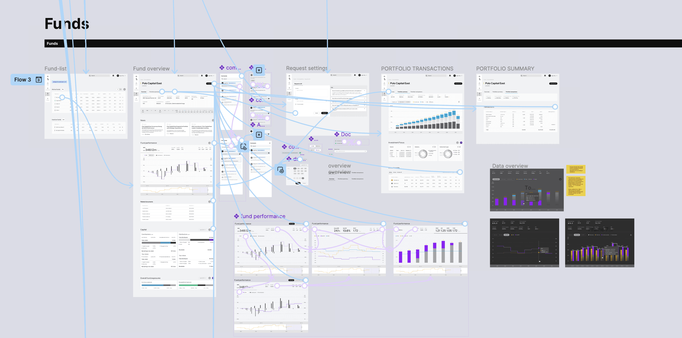
Built using 'Atomic Design' principles - a unified component library spanning desktop and mobile. Modals, buttons, forms: all reusable and consistent, cutting future build time for designers and developers.
Before/after demonstrations
Created comparative examples to communicate design rationale to stakeholders. Gave the client a concrete language for discussing decisions and helped secure buy-in for Phase 2 investment.
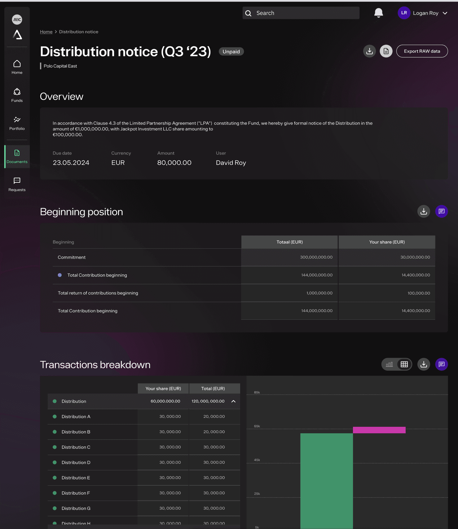
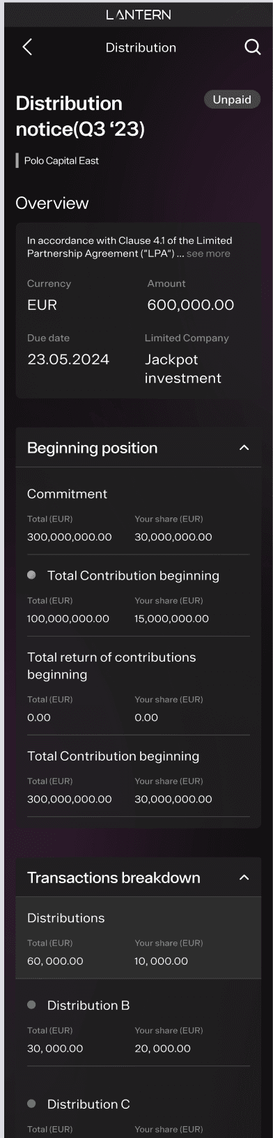
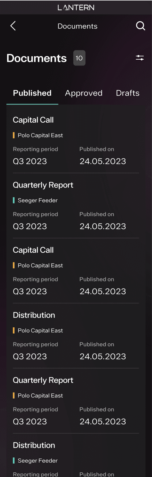
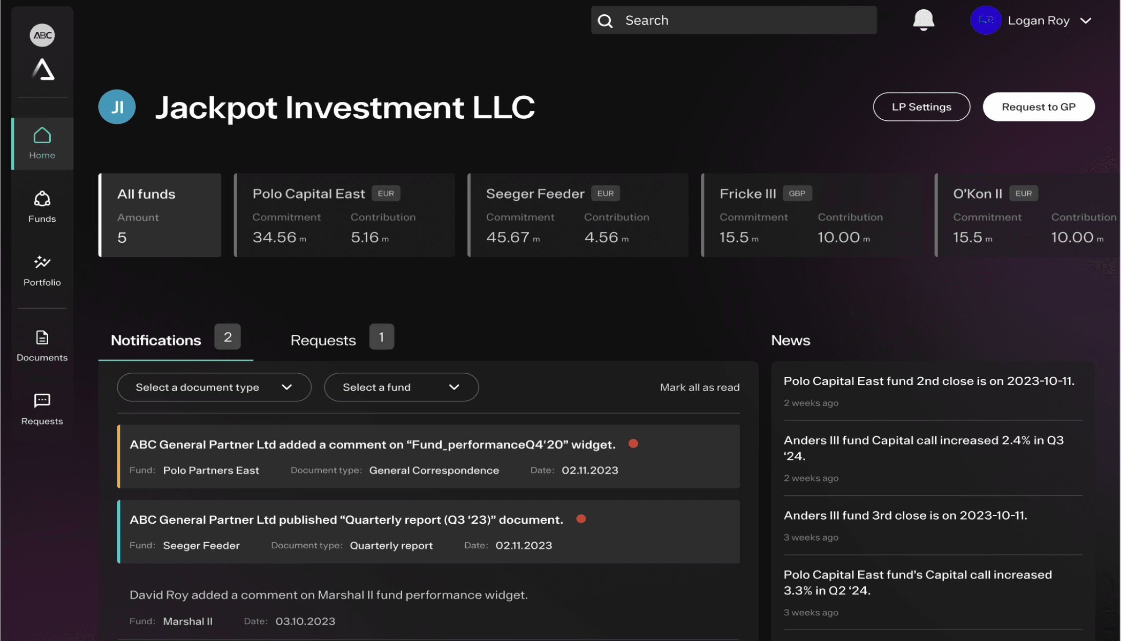
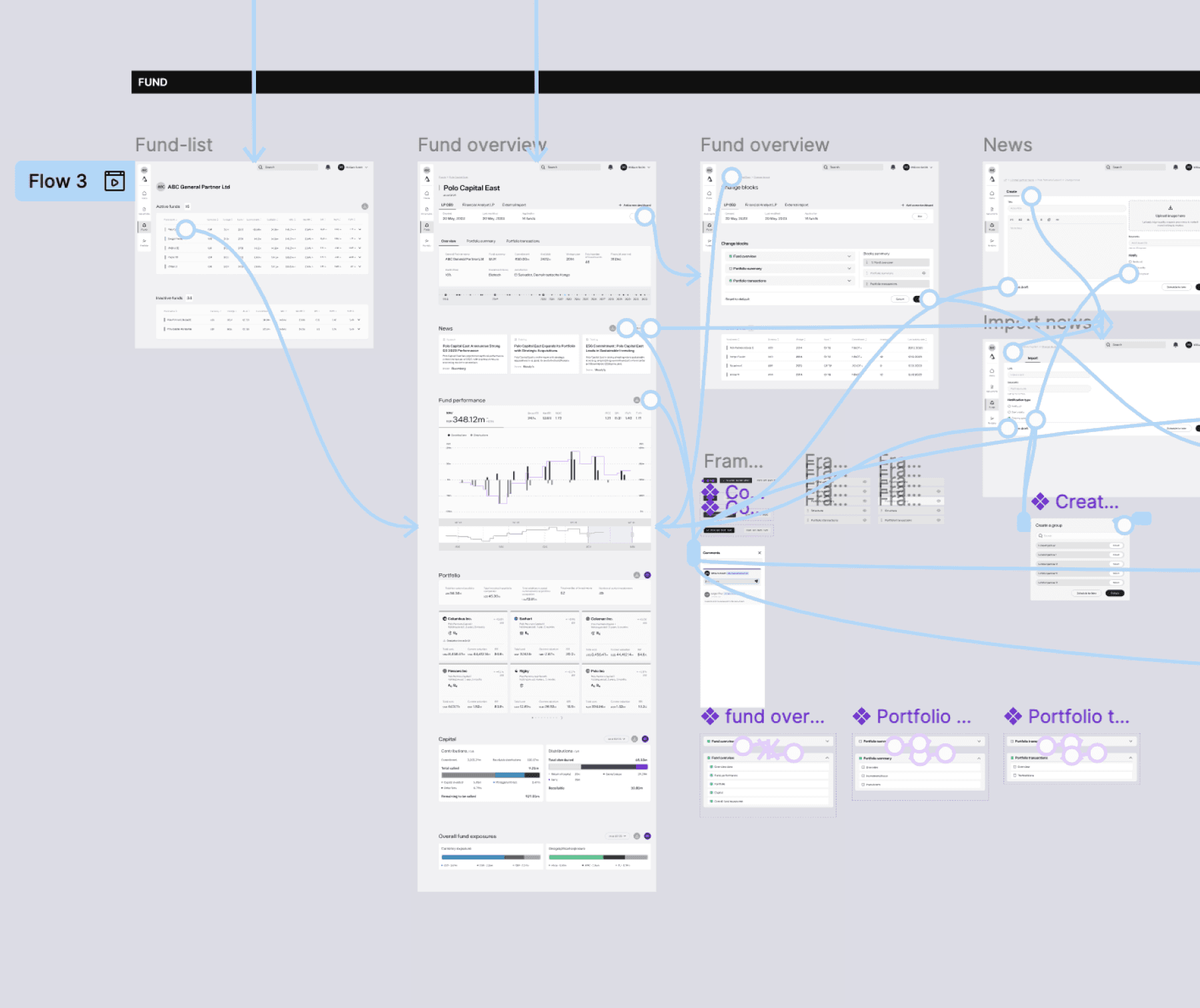
High-fidelity designs
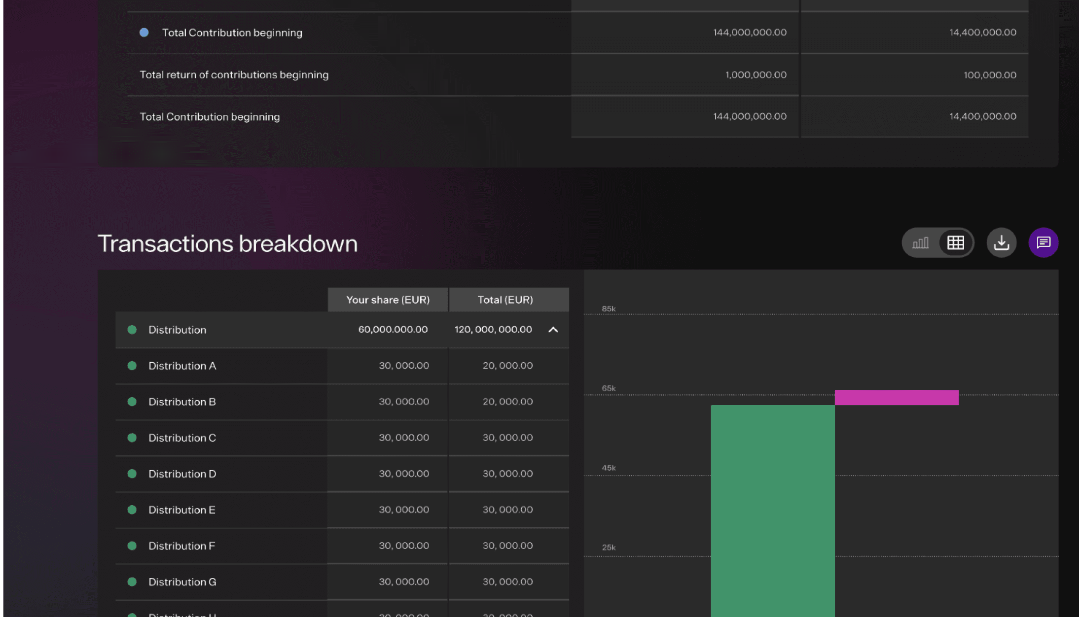
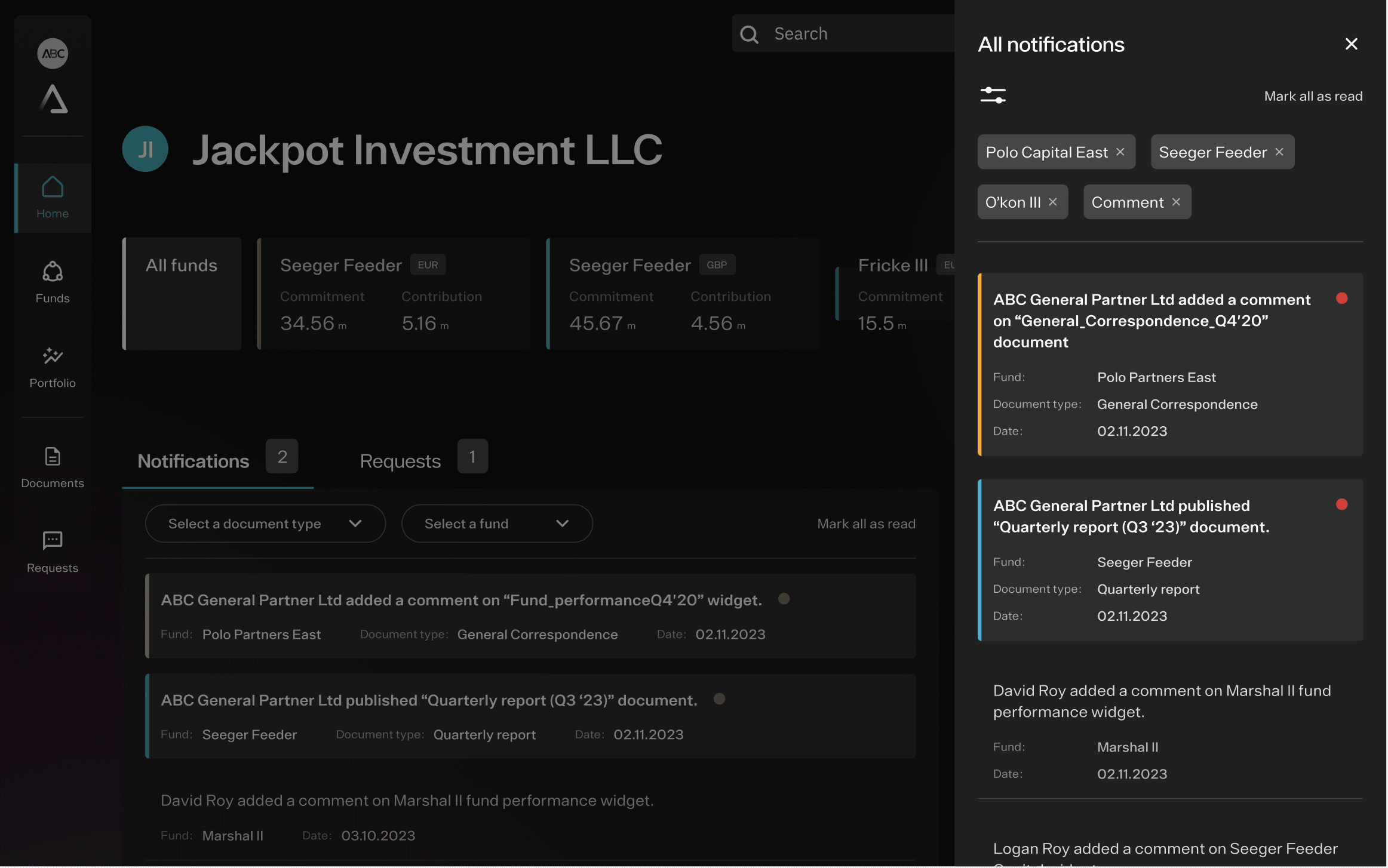
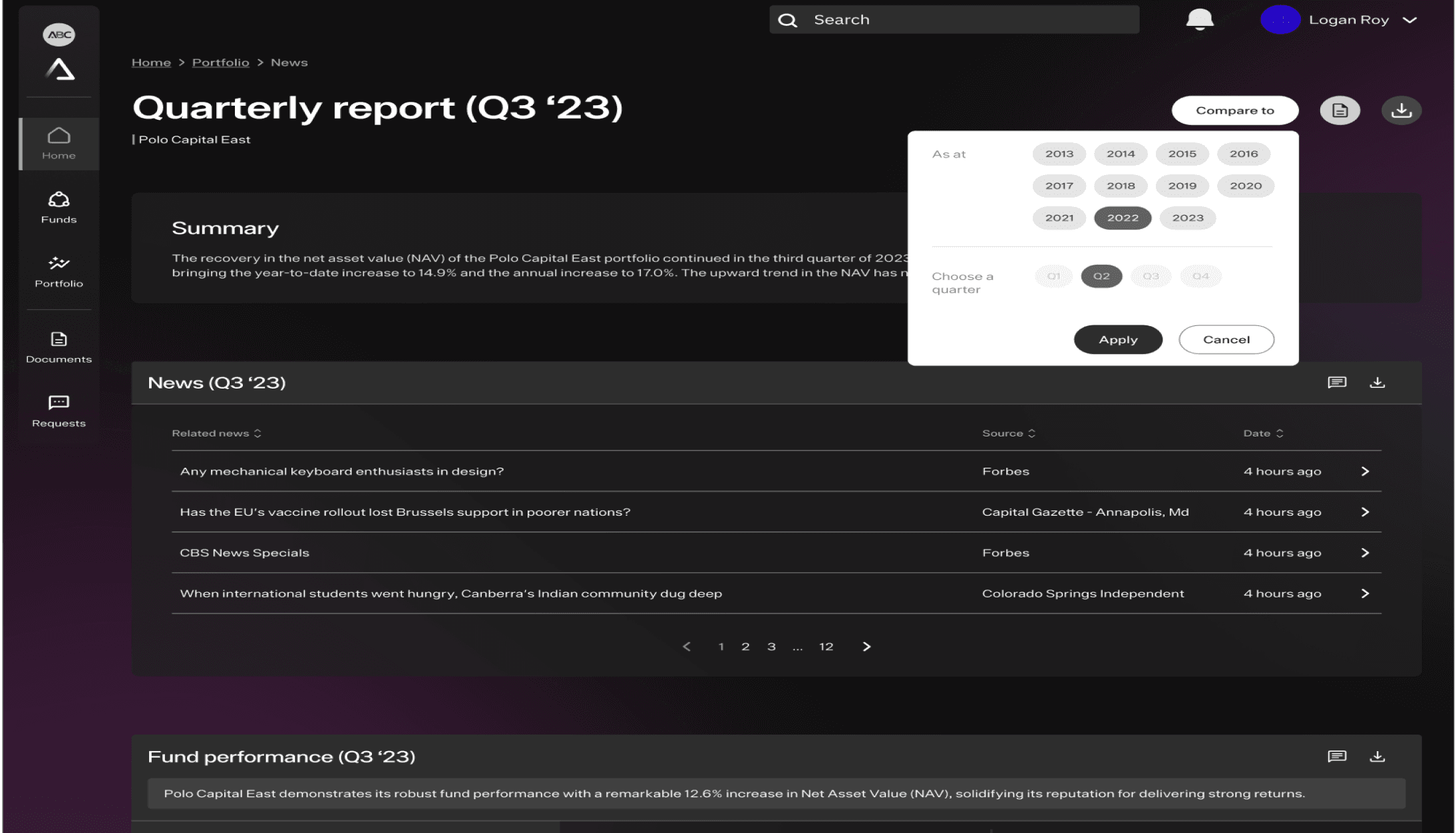
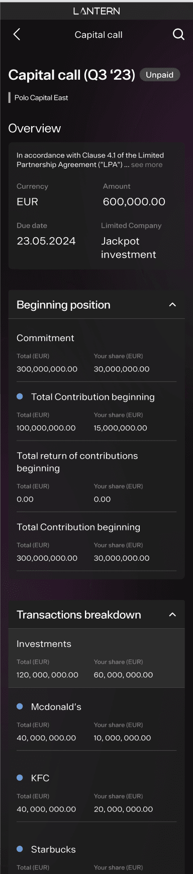
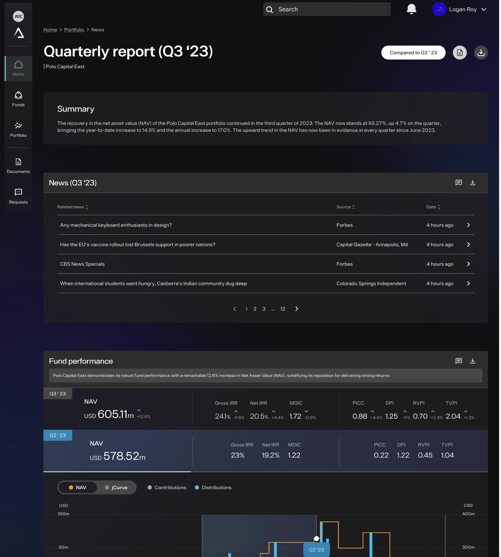
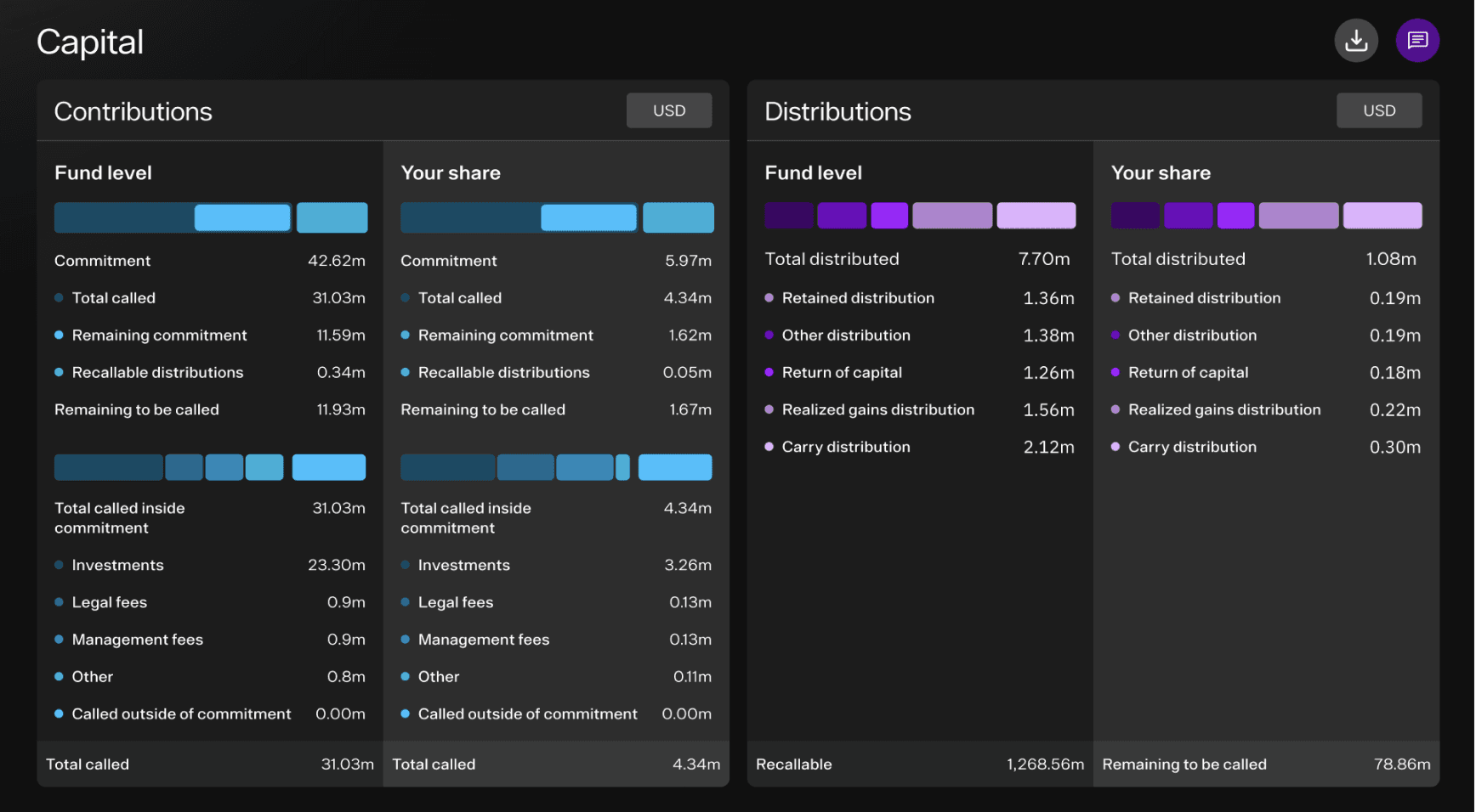
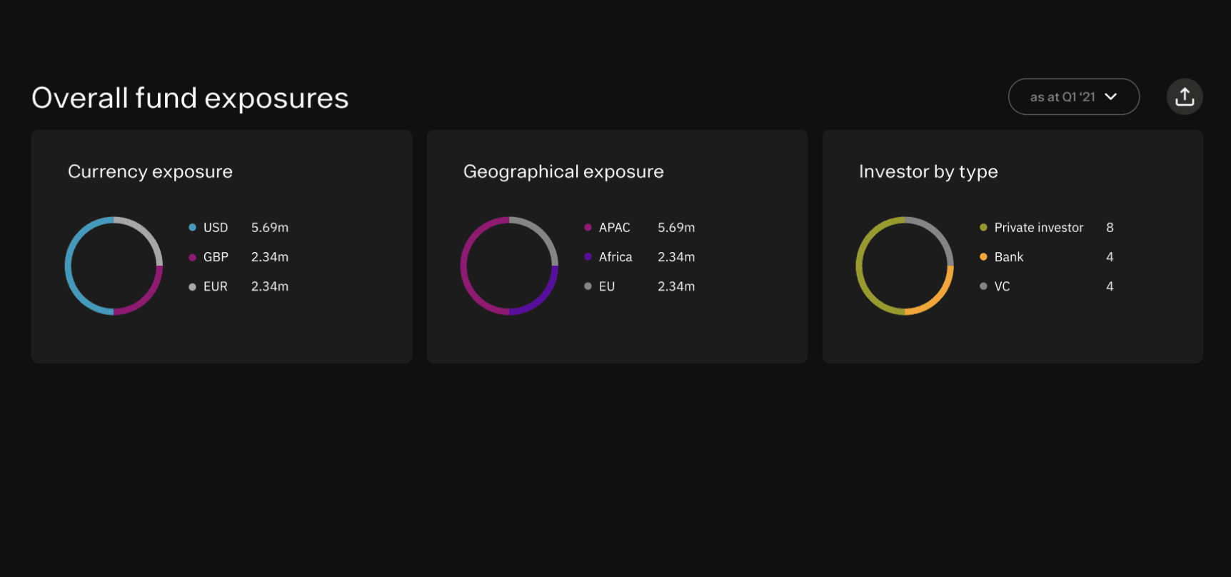
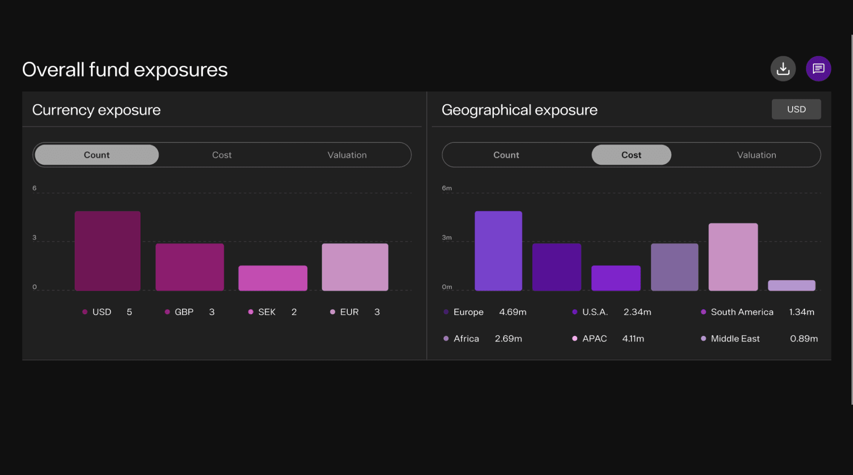
Dark-mode UI integrating complex data visualisation, optimised layouts, and mobile parity. Built on the Phase 1 design system — no reinvention, just application. Scalable patterns for the client's team to extend independently.
Investor presentation materials
Prepared the design assets the client used in their US funding presentation. Tight deadlines met through parallel workstreams - UI and presentation prep ran simultaneously.
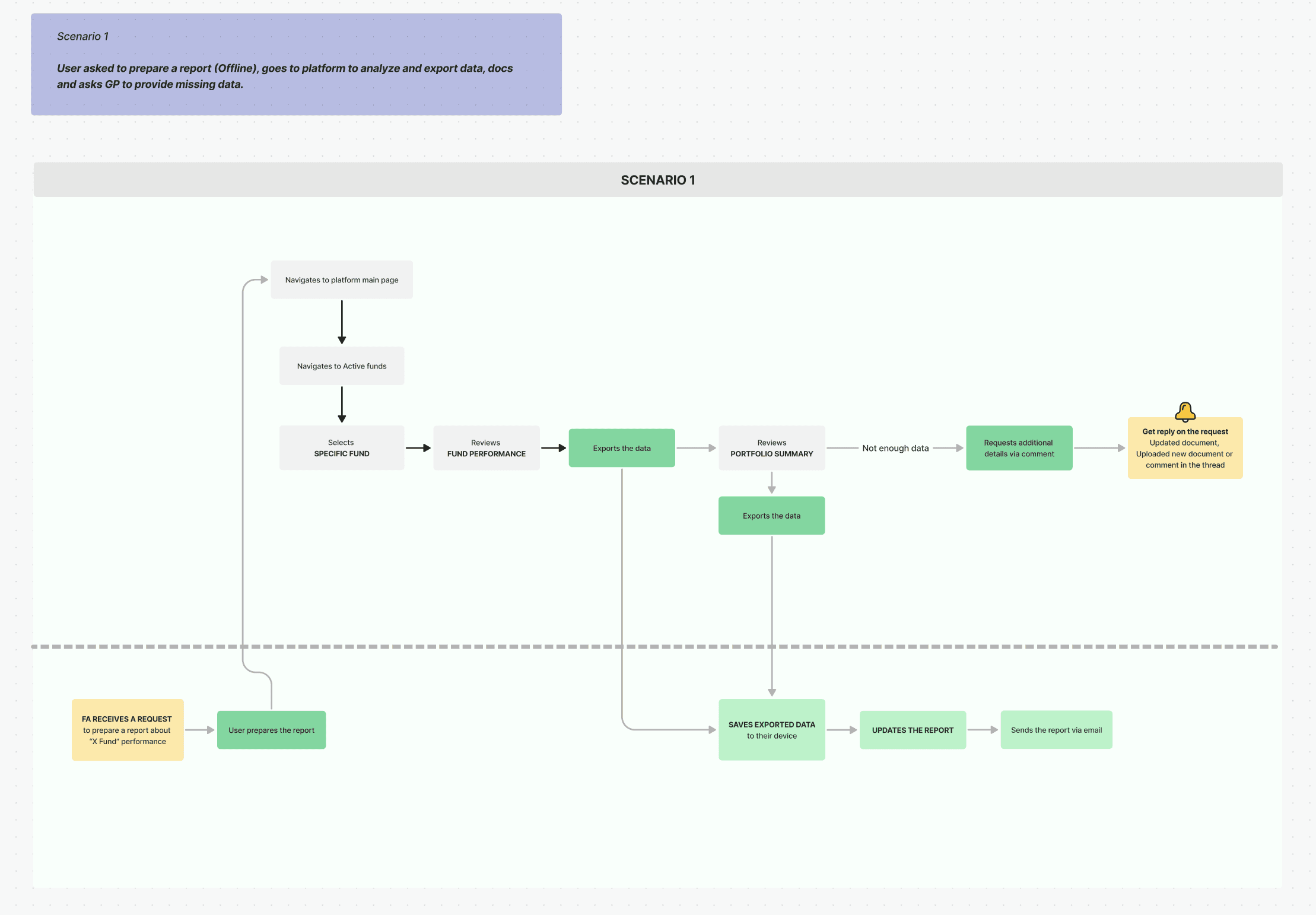
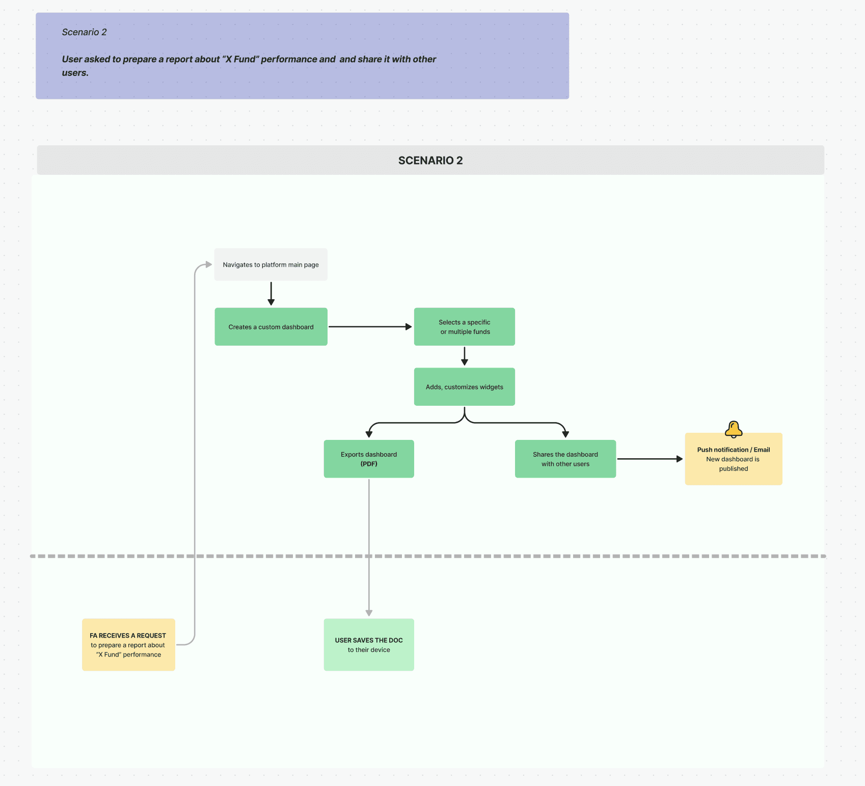
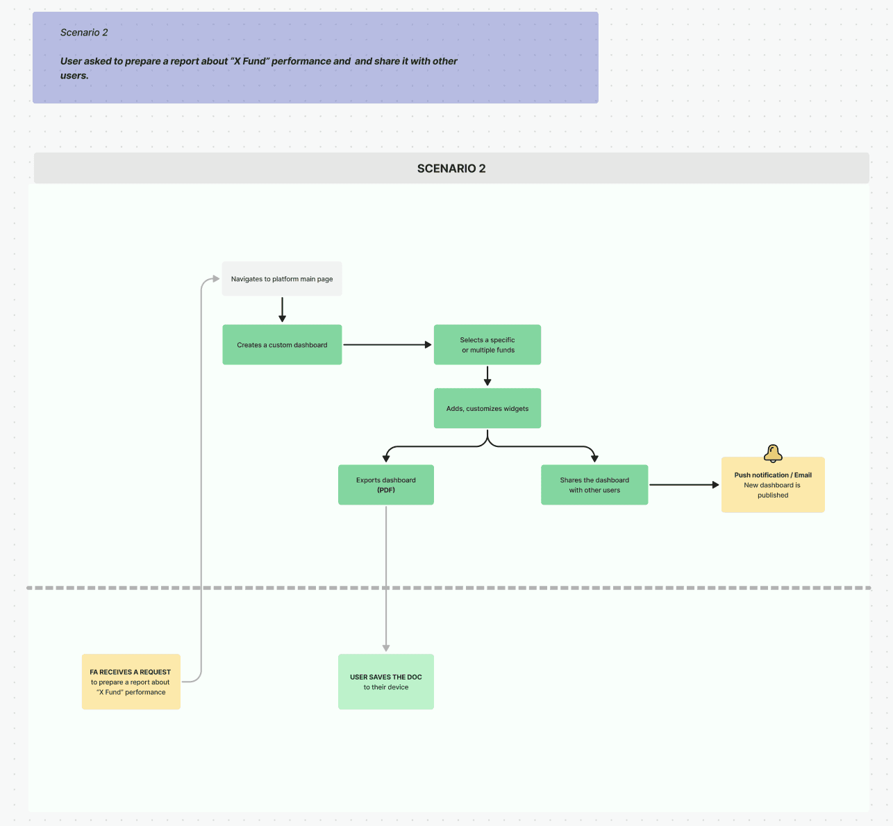
Phase 2 moved from foundation-building to product definition. The brief expanded: the client needed not only a working platform, but materials that could be used to present to US investors — with a hard deadline.
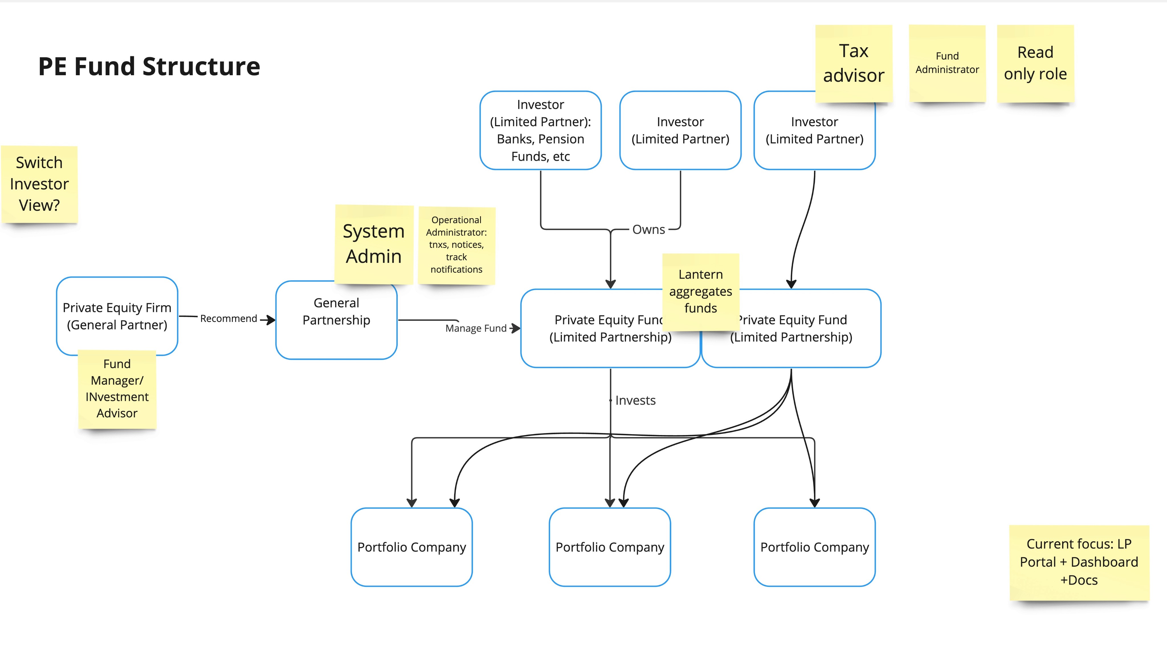
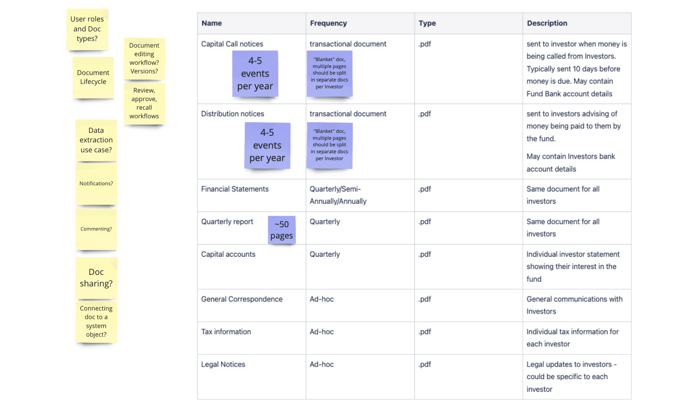
I ran client workshops to gather insights into business strategy and LP expectations. We mapped the structure of private equity funds in detail, identifying distinct user types and roles, and used this to create an initial presentation for stakeholder alignment before any design work began.
Atmoic system
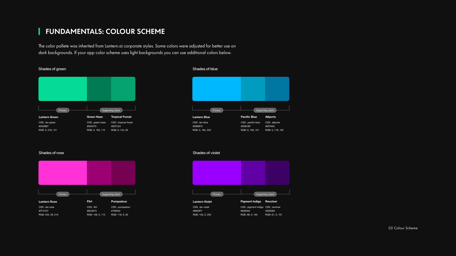
Examples - before / after
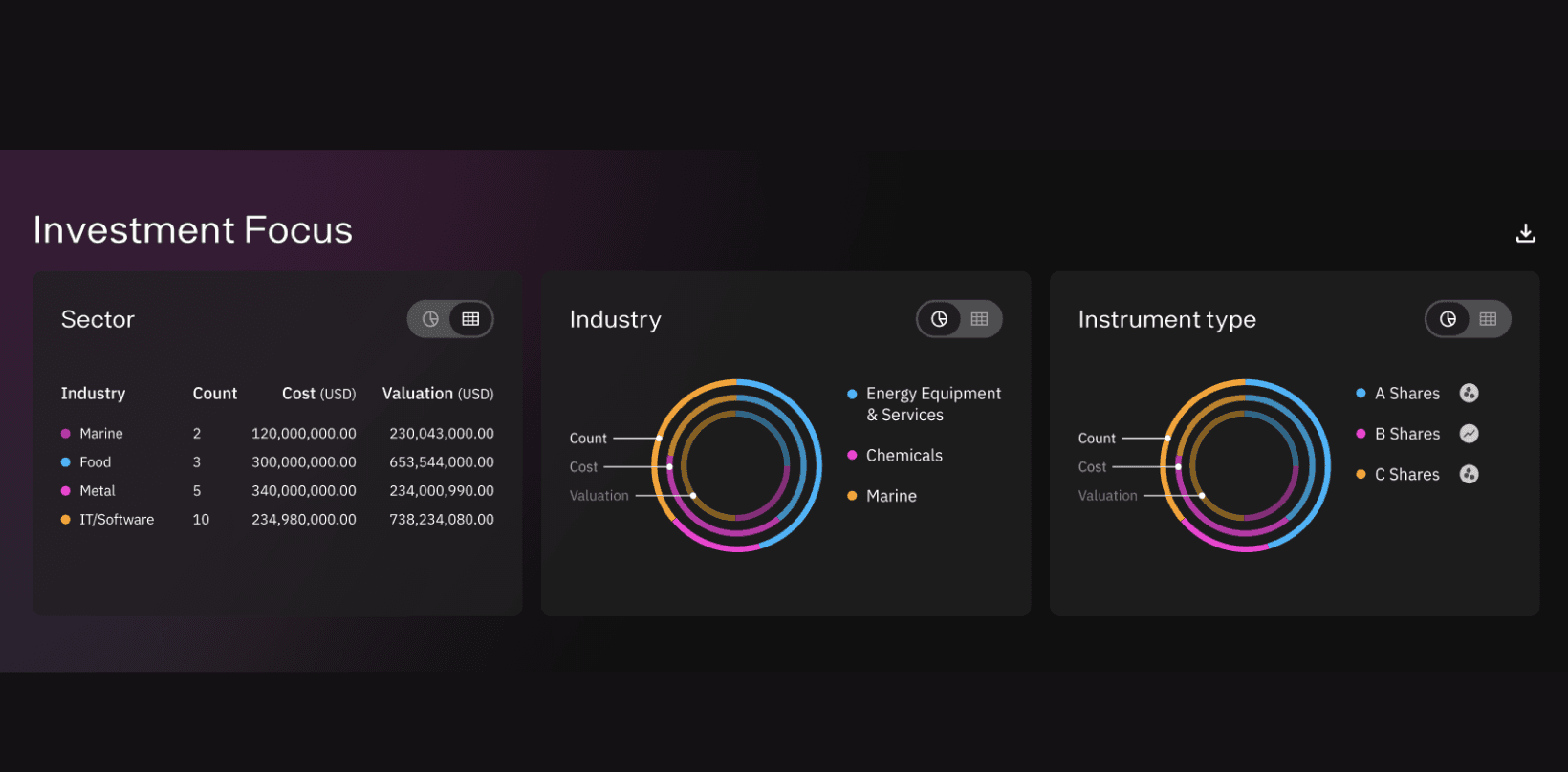
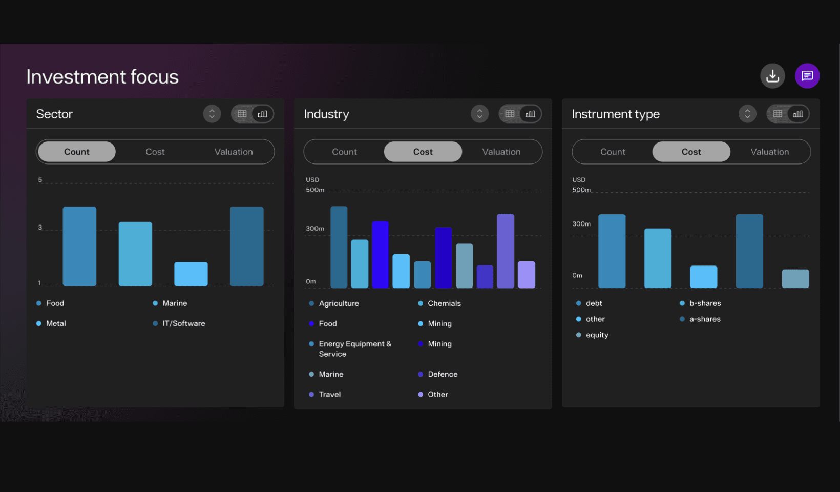
Before
After
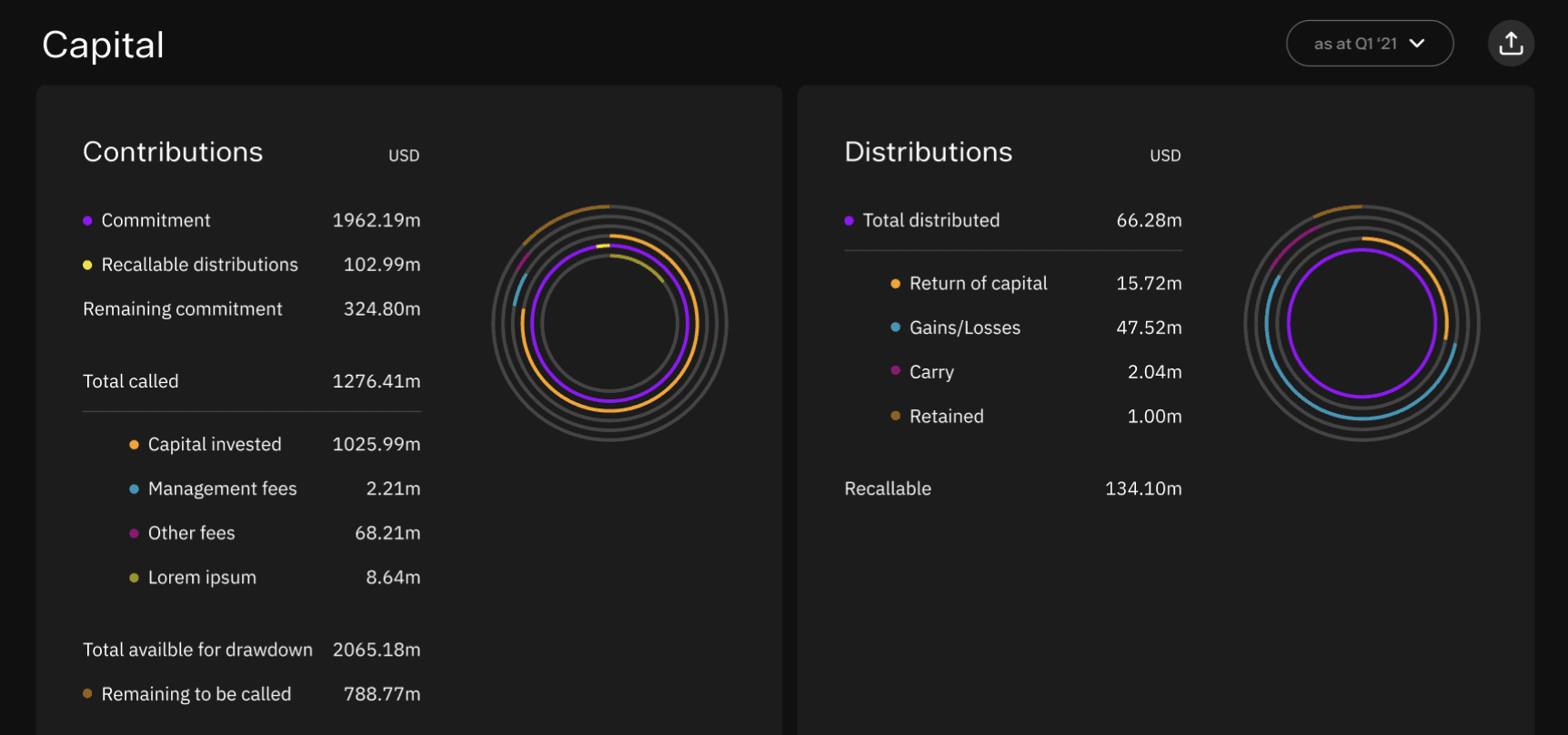
Before
After
Before
After
Phase 2 - Building the product: personas, wireframes & investor-ready UI
What it delivered
Why prototype before high-fidelity?
The temptation in a deadline-driven project is to go straight to final designs. I pushed back: a mid-fidelity prototype took two days to build and saved us from a navigation model that early interview data showed was misaligned with how LPs actually think about fund data. That decision prevented a costly rework in the final sprint.
The high-fidelity designs delivered visually polished and user-friendly interfaces for the LP platform. By integrating insights from prototypes, we refined layouts, optimised data visualisations, and incorporated secure design practices. These designs laid the foundation for scalable features, ensuring a seamless user experience across desktop and mobile platforms.
Investor funding secured
Product approved for development
Design system adopted internally
Deadline met
High fidelity designs
We delivered the full design package in time for the US presentation. The client secured the investment they were pitching. The product has been greenlit for continued development — the design system we built in Phase 1 is the foundation it's being built on.
Phase 1
Discovery, audit, design system
Phase 2
Personas, wireframes, prototype
Phase 2 cont.
High-fidelity UI + investor materials
Outcome
US pitch closed, product greenlit