Ucom telecom
About the project
Ucom is Armenia's fastest provider of fixed and mobile services, leading in IPTV, fixed internet, and mobile internet markets. They are a well-known brand, recognized with numerous awards for service quality.
The problem
Despite its success, Ucom's mobile app had an outdated interface and, more importantly, usability problems. Users found it difficult to access essential, most-used features, particularly those for managing tariff plans, checking balances, and navigating roaming options.
Key issues included:
• Overly complex navigation: Tariff Plans and Roaming Info Hard to Find
• Inconsistent design elements: Outdated and Inconsistent UI Design
• Lack of clarity on service details: Key Features Buried Under Multiple Steps
My role
As a solo product designer was responsible conduct a research and create a user friendly application.
Team
Product designer, Project manager, 4 mob developers, QA Specialist
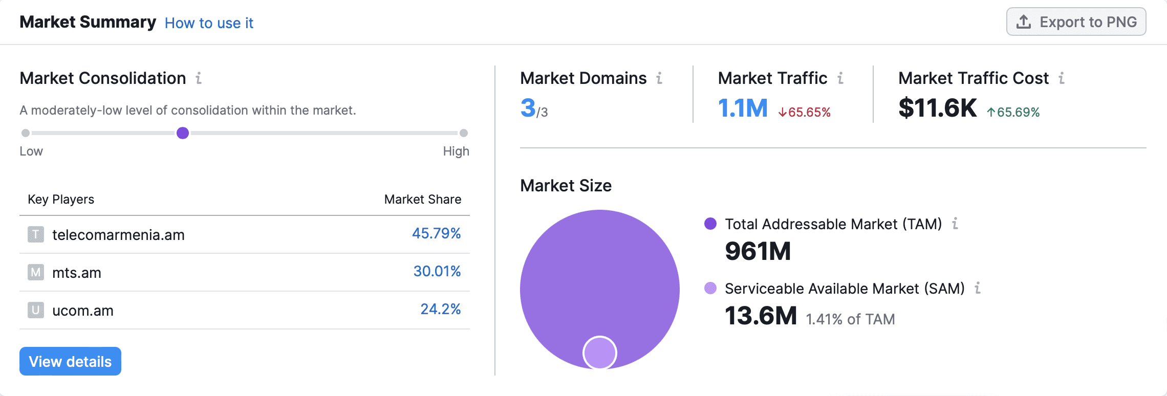
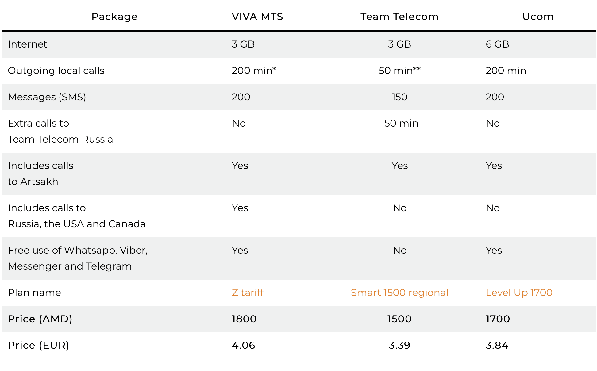
Competitor analyses
We examined similar apps, including those by Viva MTS, My Team AM and Rostelecom identifying successful design patterns such as accessible home screens and simplified tariff views. This helped guide our approach to making Ucom’s app more user-friendly.

Analyses
We conducted a quantitative analysis to obtain valuable insights and acquired data with Semrush. In 2015 investigation by "Hetq," the hierarchy of telecom providers in the Armenian market was examined, and the findings were added in an article. Upon analyzing these findings, we discovered statistics indicating that Armentel (now known as Team AM) was the initial market entrant. Subsequently, Viva MTS entered the market, bringing a fresh perspective. As of the end of 2014, approximately 1,052,398 individuals accessed the company's internet services through mobile phones, which accounts for approximately 42% of the country's population of 2,500,000. (Source: https://hetq.am/en/article/62887)

Main KPIs
In 2018, significant changes occurred within the Ucom company, resulting in numerous alterations to both personnel and positions. Consequently, Ucom faced the necessity of recruiting new staff and undertaking a substantial workload. Subsequently, from approximately 2020 to 2021, Ucom Armenia witnessed a notable increase in its customer base. The primary objective during this period was to initially secure the second position in the market, with the ultimate aspiration of attaining the coveted first place.
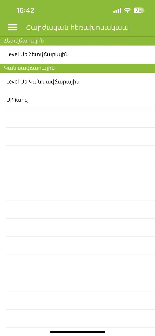
Old screens
Goal
Our goal was to improve the user experience by redesigning the core screens of the Ucom app, focusing on:
• Streamlining the tariff plans and roaming flows.
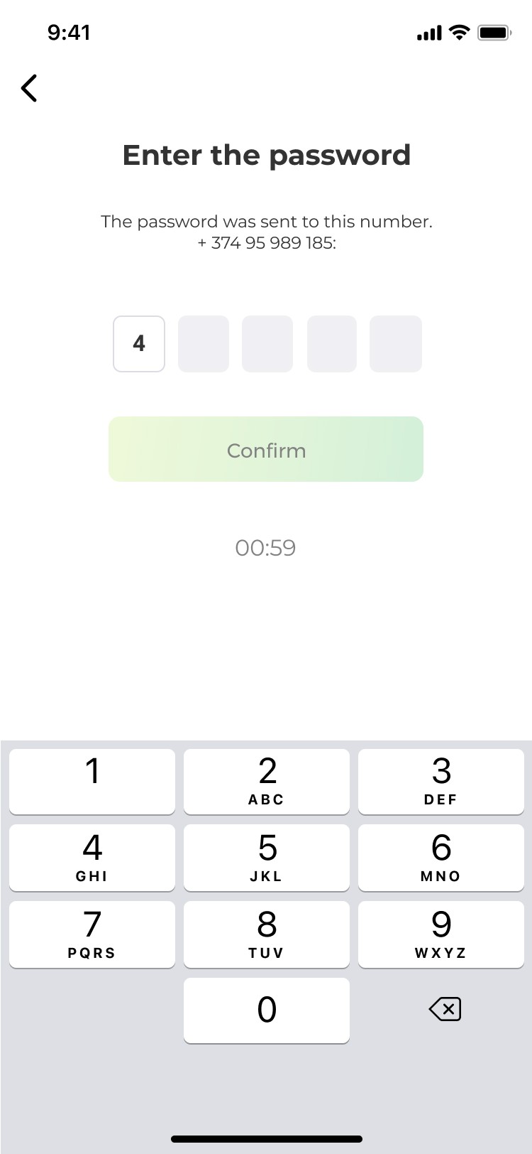
• Making the home screen more informative, with quick access to essential features.
• Improving the consistency of design
Usability study
We recruited a group of 10 active Ucom users and asked them to perform common tasks, such as checking available tariff plans, selecting a roaming plan, and navigating the home screen.
Key findings included:
• Tariff Plan Confusion: Users were unclear on which tariff plan would best suit their needs and found it difficult to switch plans.
• Roaming Accessibility: Many users reported that finding roaming details was a frustrating experience, especially when traveling.
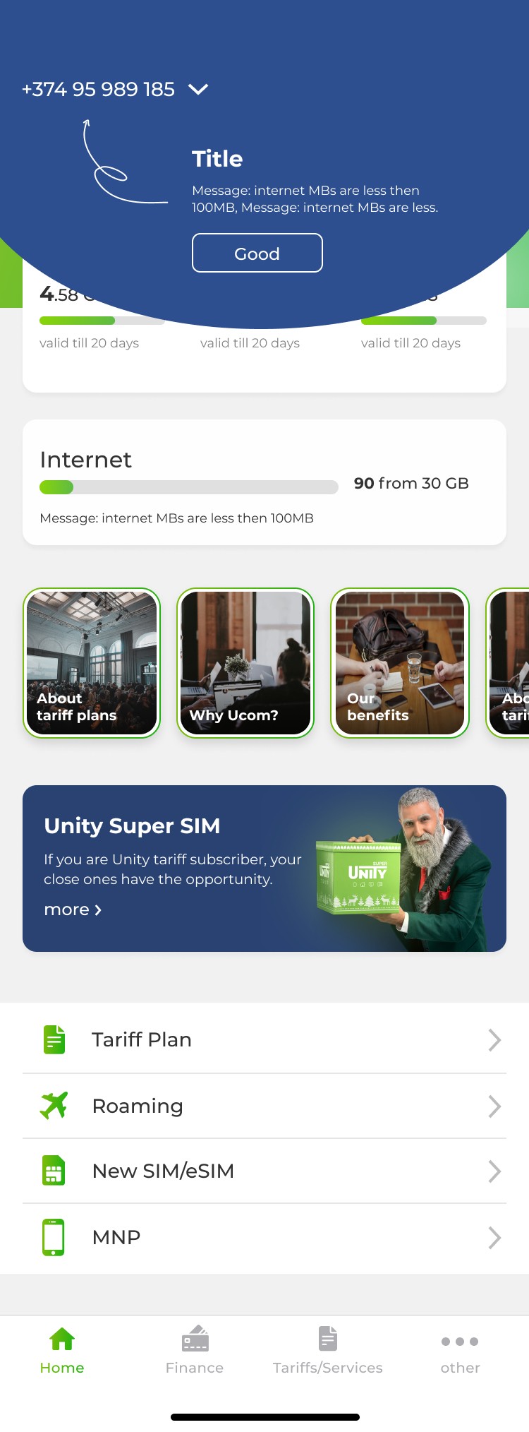
• Home Screen Complexity: Users wanted key information - like balance and data usage - available at a glance without navigating through menus.
Summary of Insights
Based on our research, we focused on three primary areas:
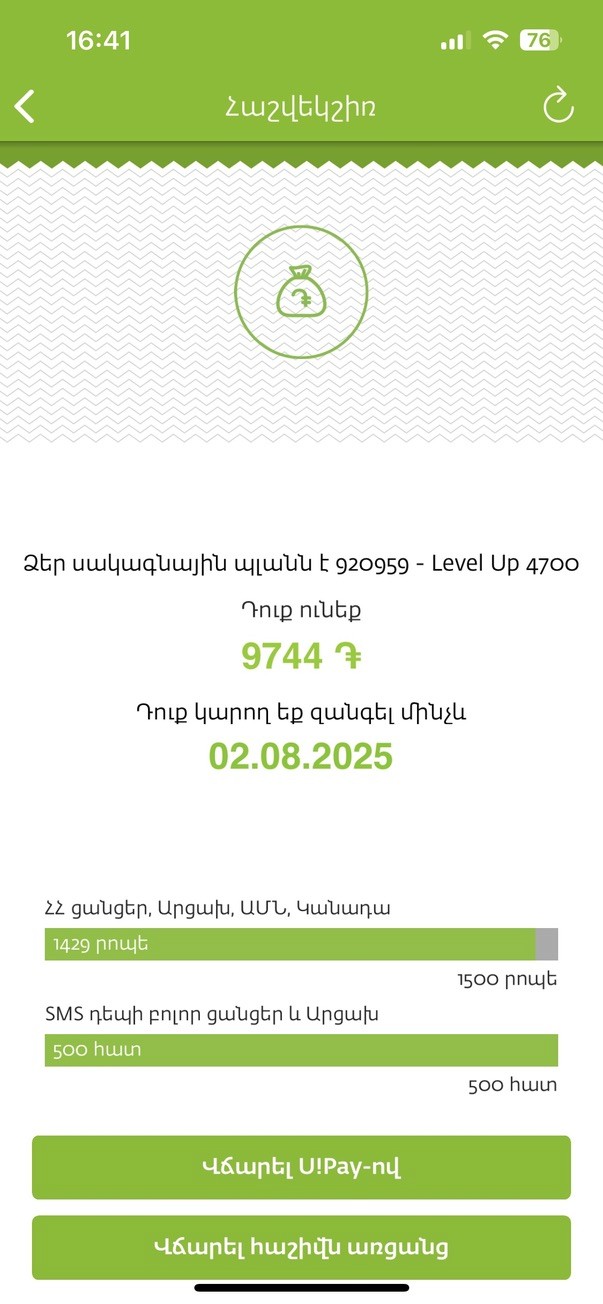
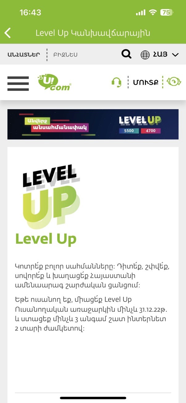
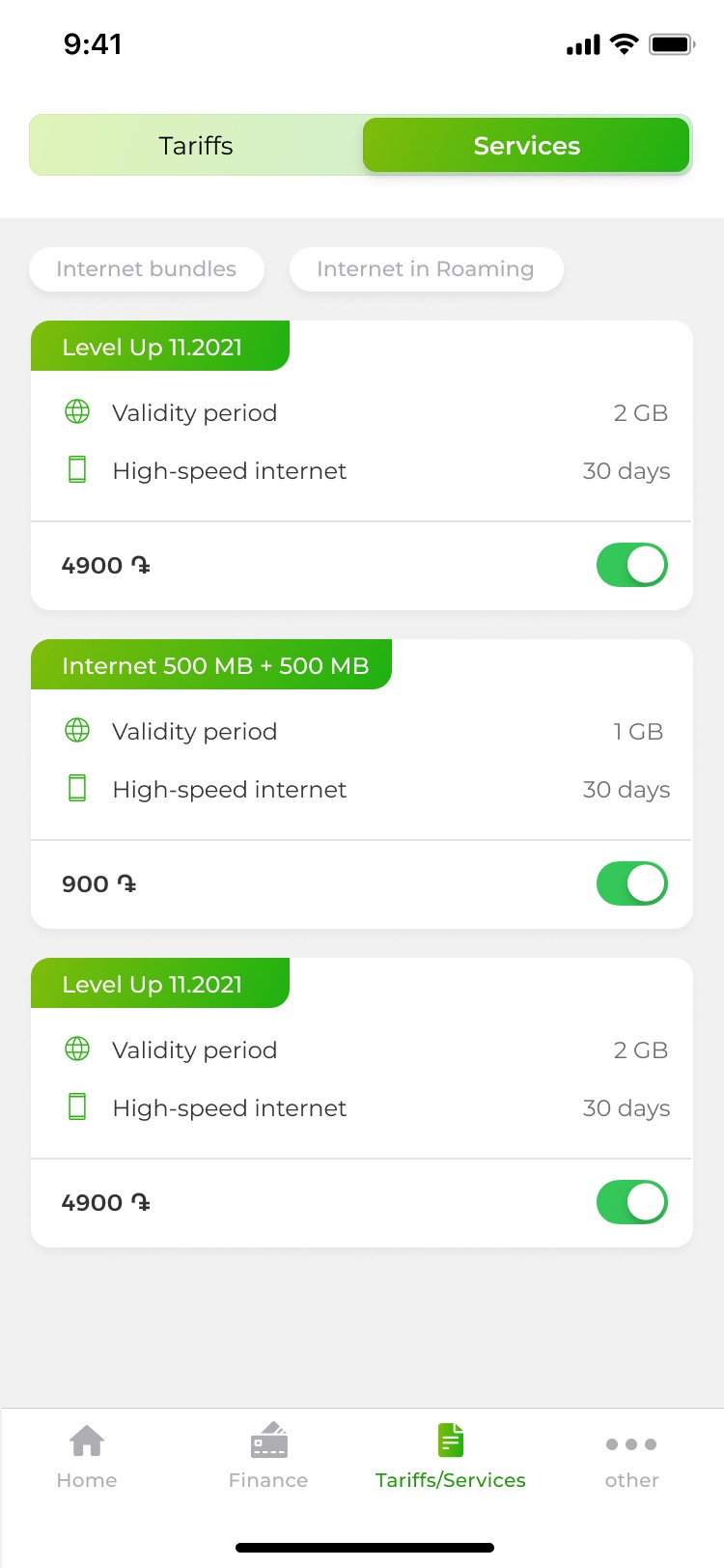
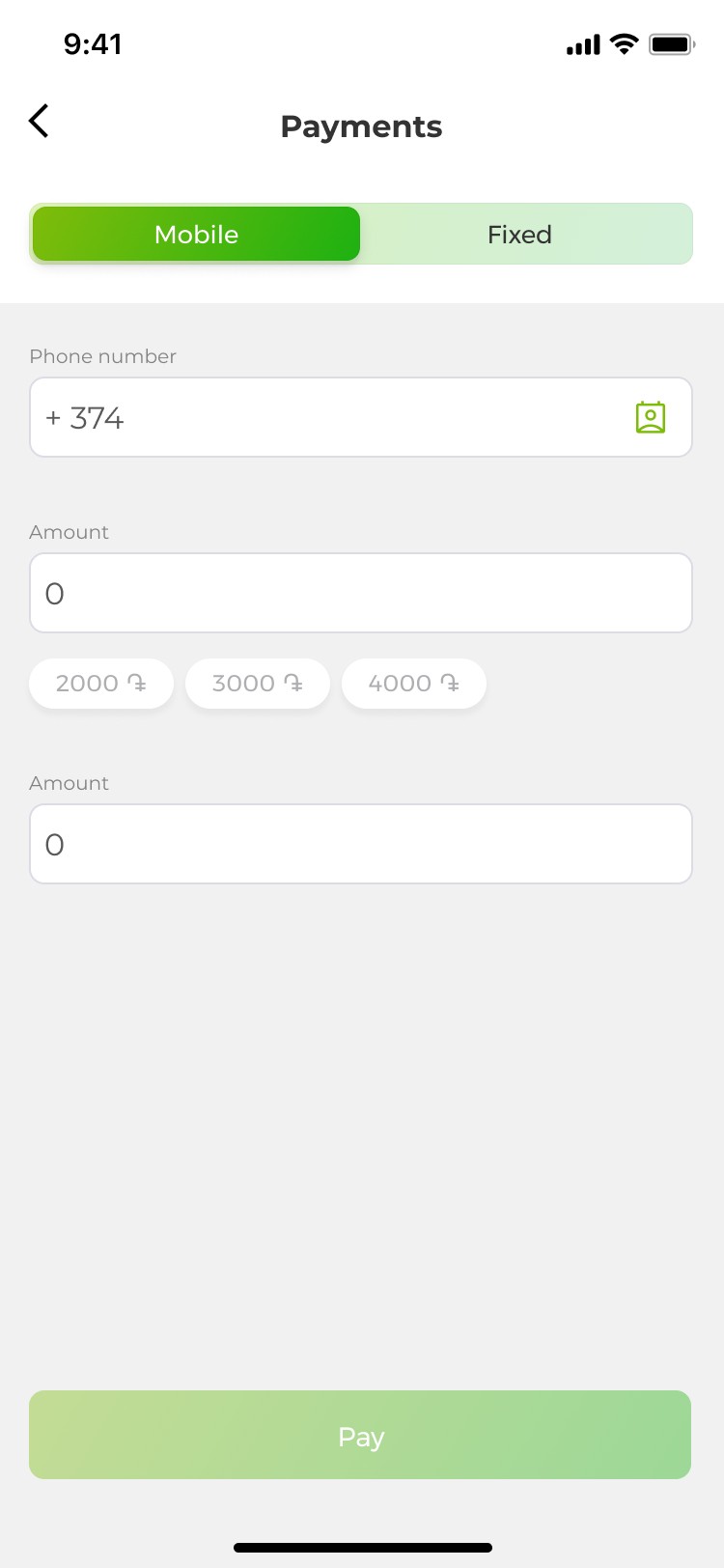
Simplified Tariff Plan Screens
• We consolidated tariff details into a single screen, displaying key information clearly, such as cost, data limits, and benefits. Users could now compare and switch tariffs without navigating multiple menus.
• We added a comparison tool to allow users to view differences across plans at a glance.


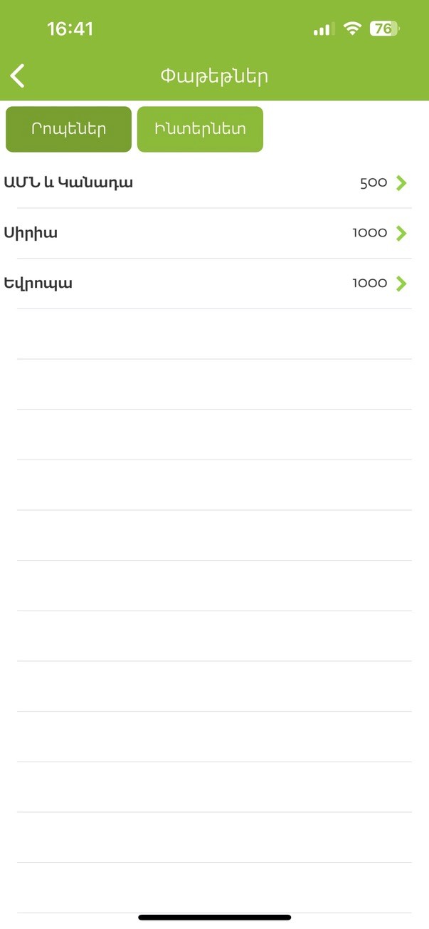
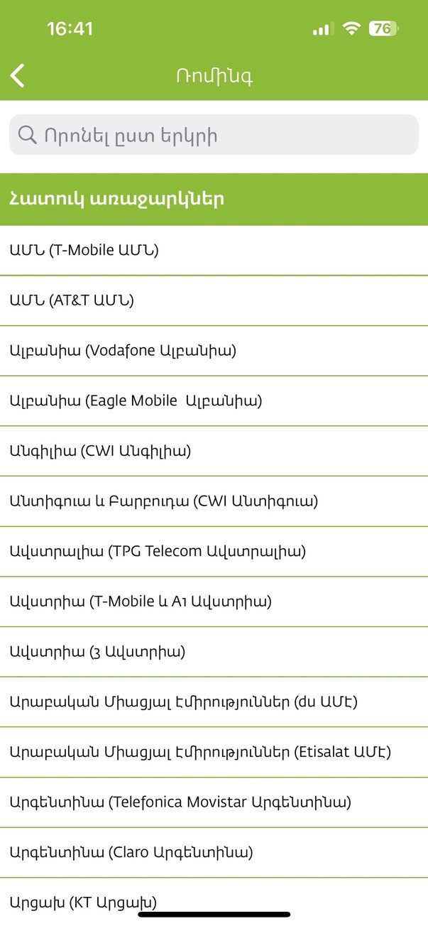
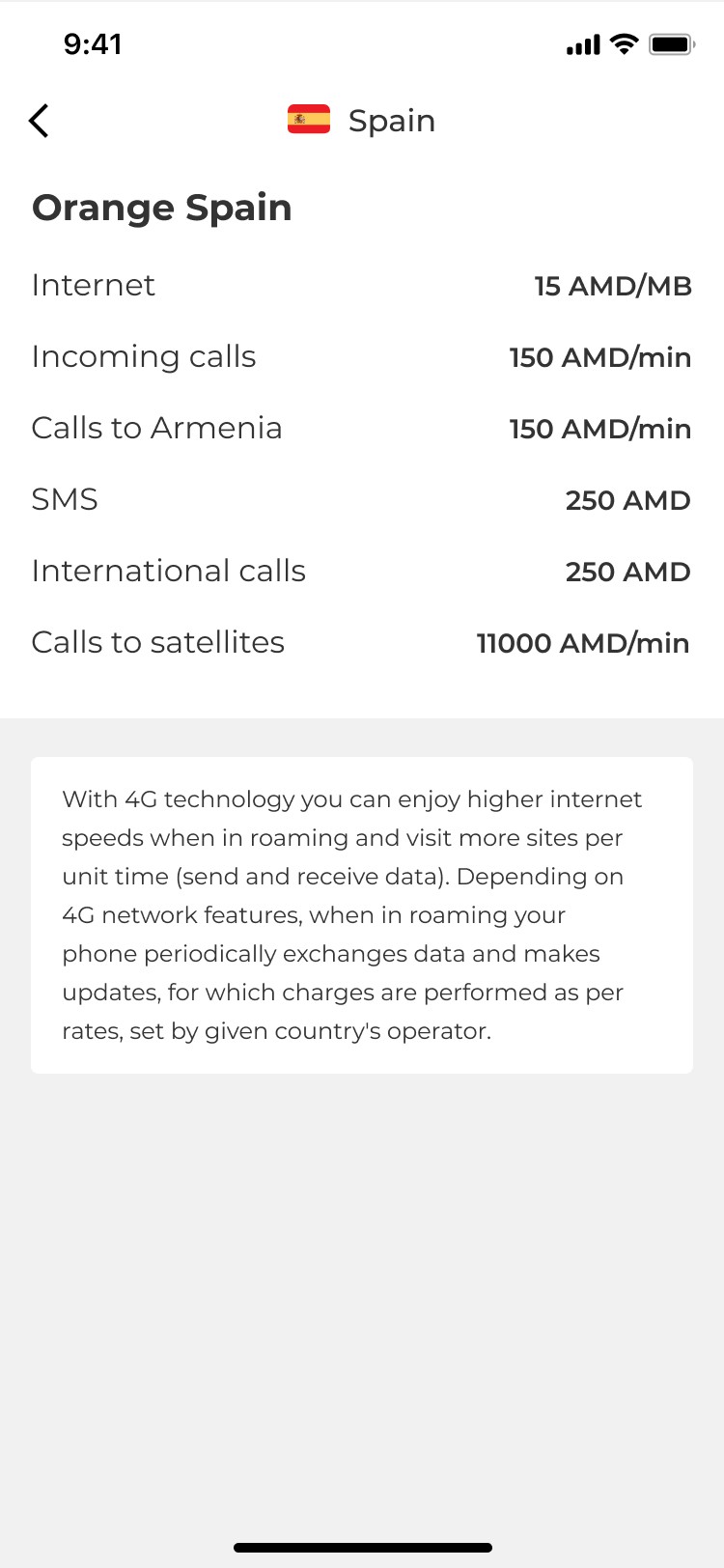
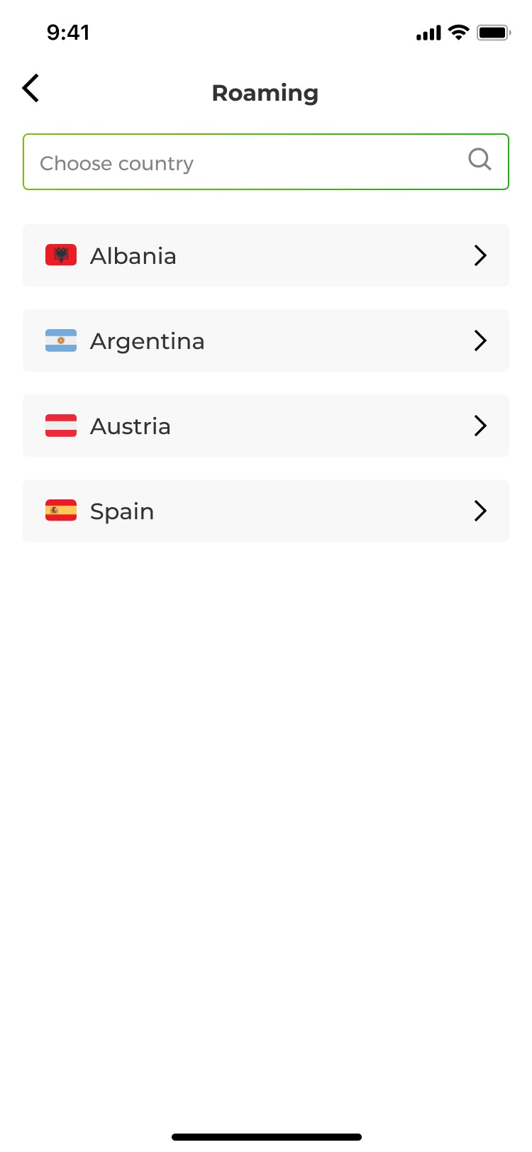
Streamlined Roaming Flow
• Users can easily select their destination country with a clear list and search option.
• Roaming rates and special deals are clearly displayed.
• A simple toggle button allows users to activate roaming with a single tap.


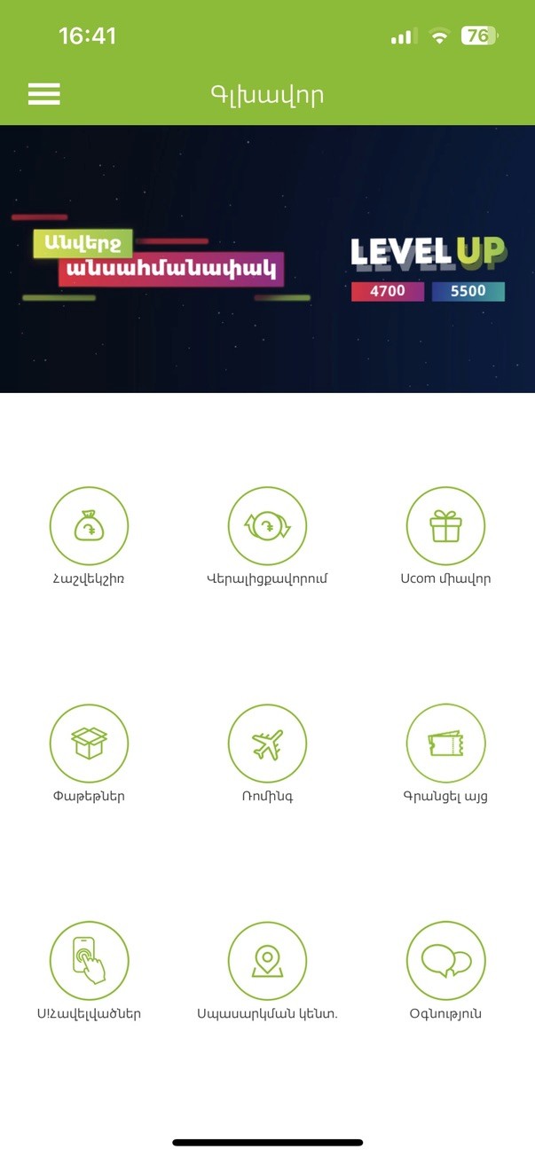
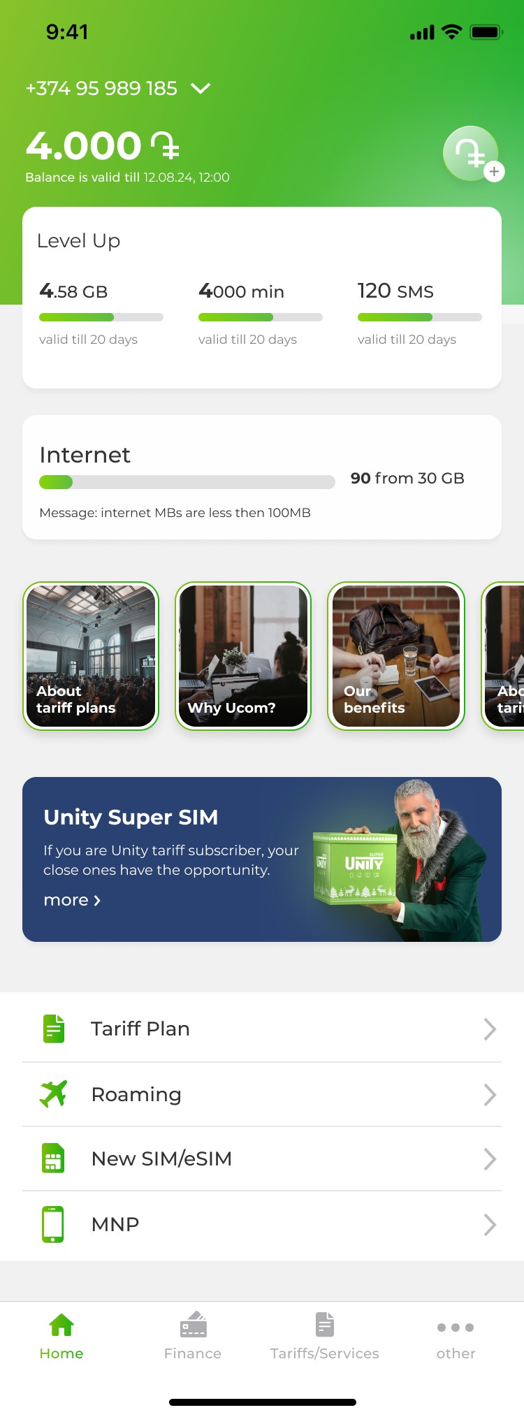
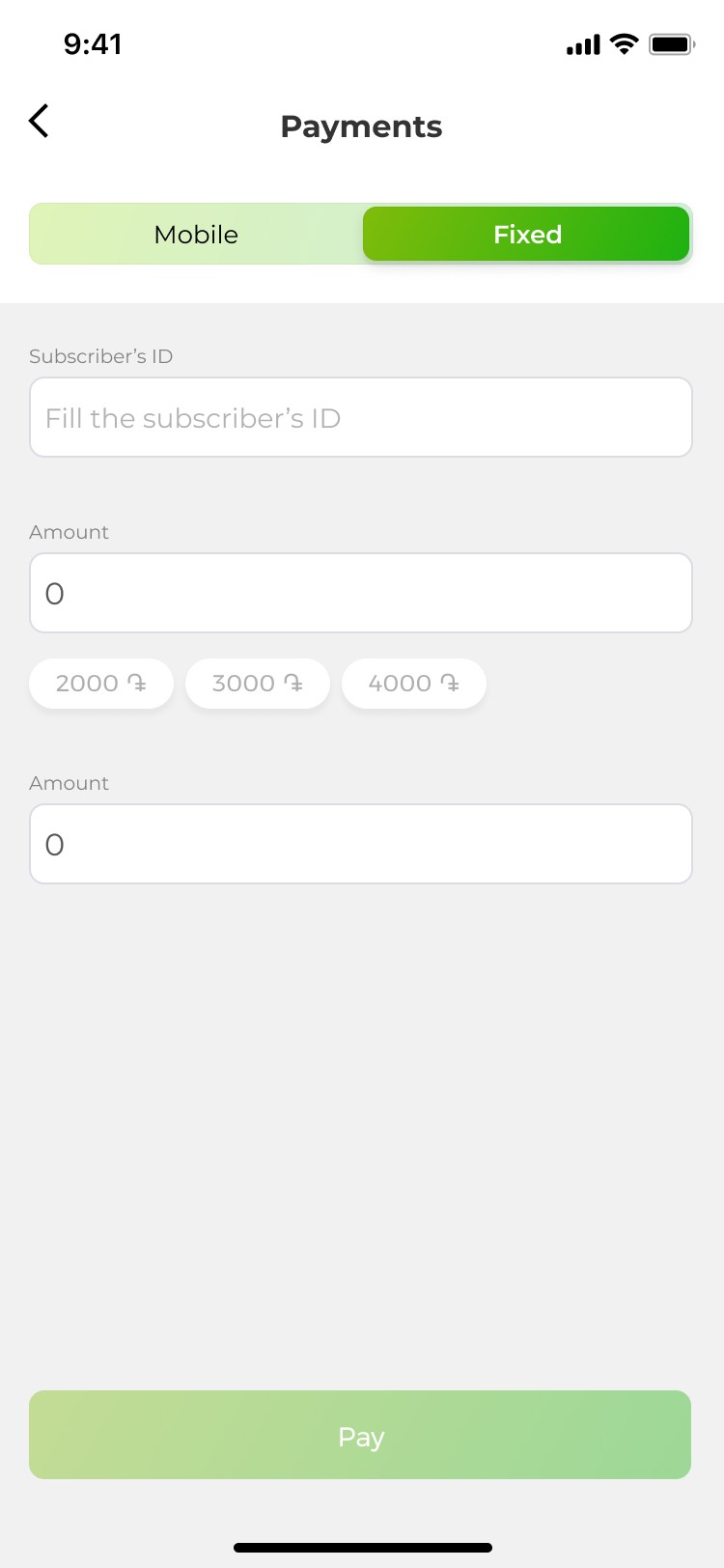
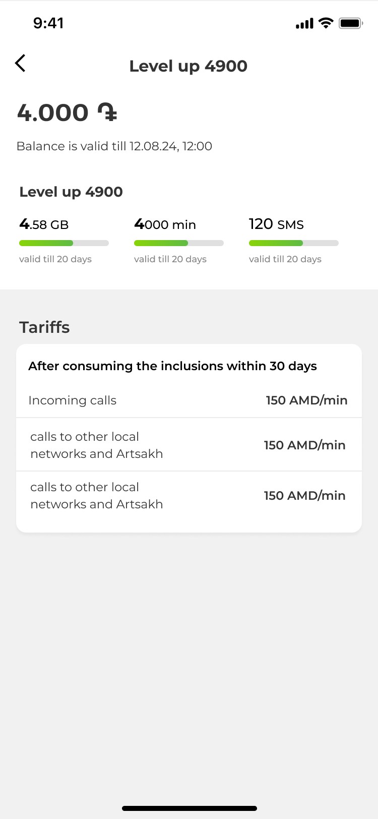
Informative Home Screen
• We redesigned the home screen by keeping in mind that essential information should be immediately accessible, displaying the user’s current balance, data usage, and active plan status.
• We simplified the main navigation by adding quick-access buttons for 'Finance,' 'Tariff,' and 'Services.


Summary of the screens


Validation and Results
To validate the impact of our redesign, we conducted a follow-up usability test with the same group of users:
78%
of users found the new design “easy to use,” an improvement from the initial test.
More Efficient Interface:
Most-used features were now easy to find, there was no need to navigate through multiple steps.
24%
App downloads increased by 24% within a month after release, indicating higher user interest and engagement.